Spooky Spirits 2024 Event Signs Graphic Design


Roles
Graphic Designer
Tools
Adobe InDesign, Adobe Illustrator
Introduction
Spooky Spirits 5k is an event by Veugeler Design Group that occurs during the Halloween Season in October. Participants can either walk or run the 5k, which has spirit tasting stations scattered throughout the route where the racers can taste test new beverages, or fall back in love with their old favorites.
Design Process
User Needs
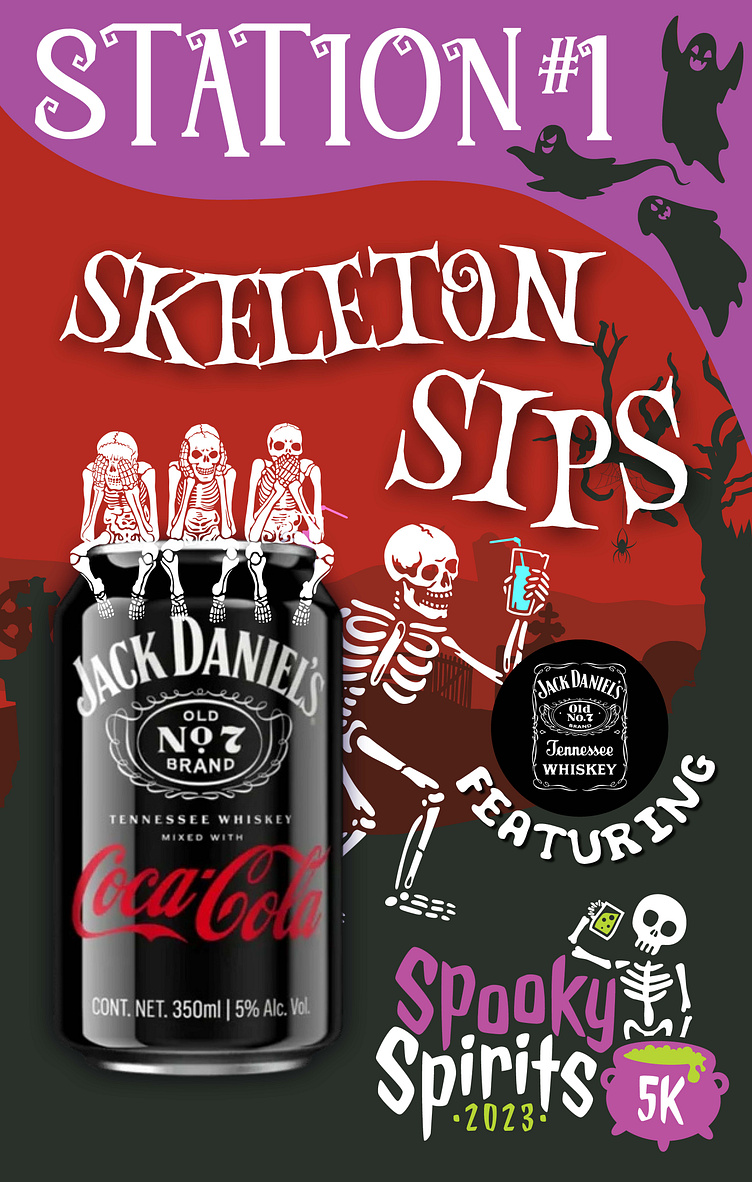
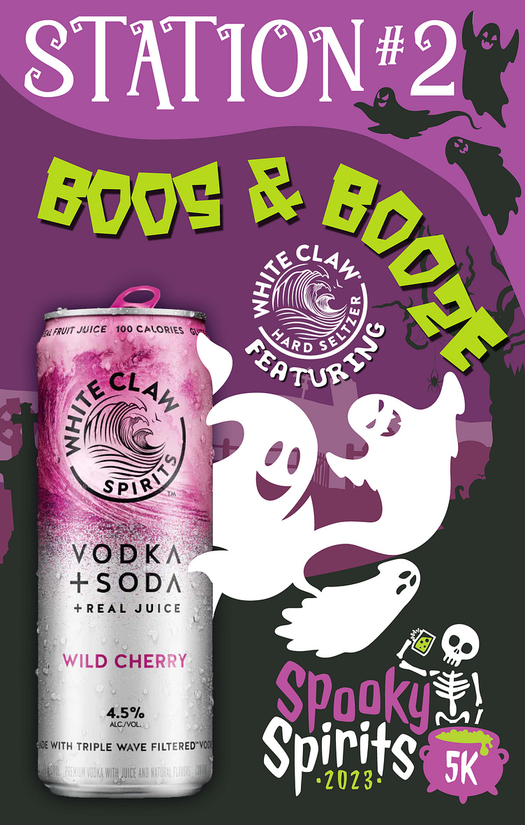
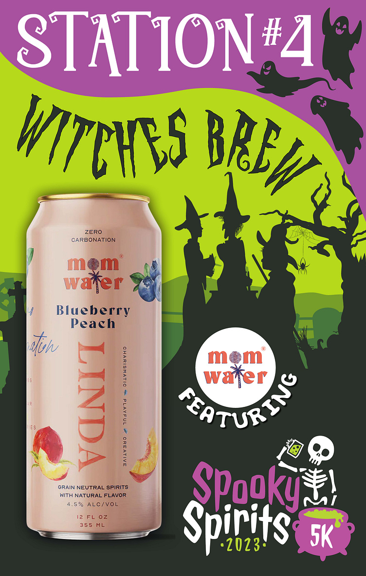
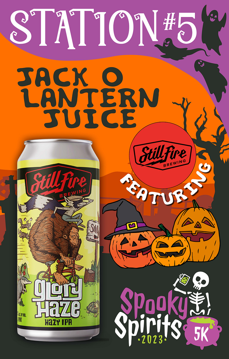
Signs for every station that mark the number and beverage,
Must incorporate the Spooky Spirits logo
Must incorporate the featured beverage logo
Must incorporate the beverage can itself
Needs to be Halloween themed
Execution
6 station signs that incorporate the Spooky Spirits Logo, the featured beverage logo and a can of the featured beverage
Halloween backgrounds
Creative, Halloween themed names for each beverage
Visual imagery that ties the name and beverage together
A top banner that gives all the different banners a sense of cohesion
I wanted to focus on interesting visuals to accompany the featured beverages in each of the signs. I picked the main consistent purple and black from the Spooky Sprits logo and carried it through each sign to promote the overall event and provide cohesion amongst the stations. It was important to me to create a themed picture within each sign that made sense with the creative title but didn't detract from the beverage itself. In order to do this I picked a single background and modified the colors per the sign. Then, based on the title, I chose graphic elements and modified them in Adobe Photoshop or Illustrator to crop and arrange them around the beverage. I isolated the featured beverage logo to a circle so that it would be easy to read and stand out from the background.
Below: The final designs for the Spooky Spirits 5k station sinage
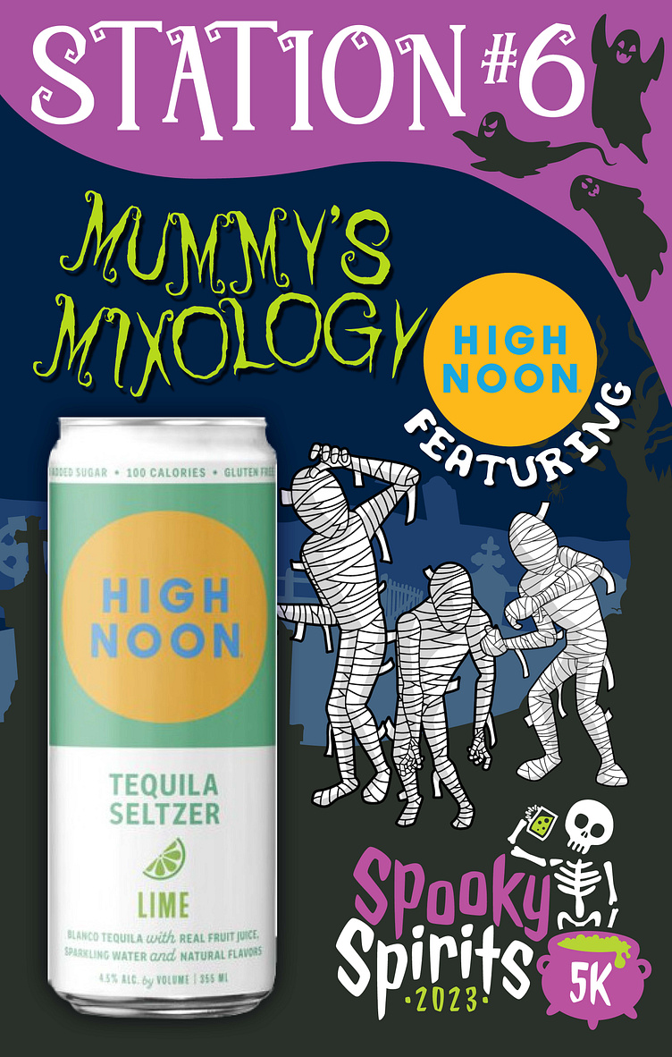
This project was good practice in spacial awareness over a wide variation of the same thing. I really enjoyed being able to think about each sign differently and appreciated the challenge of creating a visually interesting image that fit around the needed elements. A particularly difficult part of this project came from the placement of the featured beverage logo: because each of the visuals where vastly different from each other, the location of the logo was affected across all the signs. Eventually the choice to place them in circles with surrounding text remedied this issue and allowed for ease of movement around the picture plane. If I redid this project, I would experiment with other kinds of header banners that didn't take up so much space at the top of the sign. I would also want to revisit the featured banner logo to try and come up with a solution other than framing it inside a circle.


