Gwinnett Ballet Theatre Gala Invitation Graphic Design

Roles
Graphic Designer
Tools
Adobe InDesign, Adobe Illustrator
Introduction
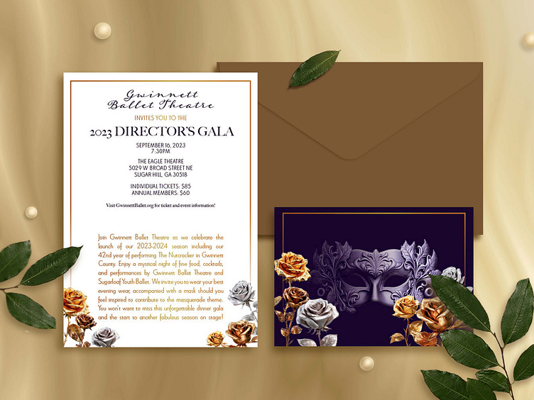
The Director's Gala is an event hosted by the Gwinnett Ballet Theatre where attendees can appreciate and celebrate decades of performances put on by the dance company. This particular year, the event was themed as a masquerade and would host numerous performances by dancers in the Gwinnett Ballet Theatre company, accompanied by food and beverages for all attendees.
Design Process
User Needs
An invitation that incorporates the given text
Must have the date
Must have the location
Must have the ticket prices
Must have the website
Should have a masquerade ball theme
Needs to be elegant and mature
Execution
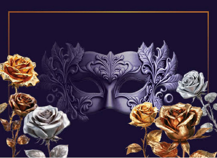
A horizontal invitation with a mask and floral elements on the front panel
The front panel theme is carried into the inside of the card
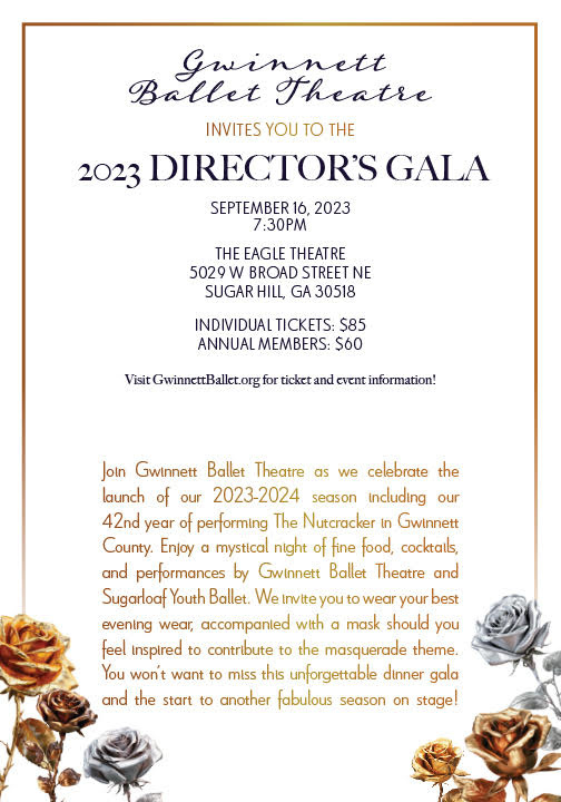
All text is present, including location, times, dates, website and ticket prices
All graphic elements are cohesive and similarly stylized
During the design process, I tested multiple different kinds of masks against a plum navy background. I ultimately landed on the chosen mask because it was detailed but not gaudy, and had natural elements that would mesh well with the florals I was planning to add. I wanted to involve an element of mystery about the mask, so I added a transparent gradient that gave the illusion of the mask emerging from the background. I then added flowers in full opacity to the foreground, choosing ones that had a similar texture to the mask itself. I wanted these to be both silver and gold to tie the gold accent border to the silver mask thereby unifying the picture plane.
Below: the front panel of the Director's Gala invitation
For the inside of the invitation, I used multiple fonts to distinguish the host of the event from the rest of the text. Using a calligraphic script at the top of the card supplied an element of elegance that matured the rest of the invitation. I chose to use gold for text regarding the nature of the event itself, while saving the navy blue for information such as the time, location, cost and website. I wanted the front paneling to echo inside the card, and to achieve this I simply added the florals to the bottom sides of the invitation, making sure they didn't detract from the text itself.
During this project I became aware of how altering the size, color or state of an element can change the entire feel of the design. Using various masks on the front panel dictated what the rest of the invitation would feel like, and would later inform what floral elements I would choose to use. The most challenging part of this project was actually the arrangement of the text and choosing the fonts for different bodies of text. I learned that the highest priority is readability, which informed how I proceeded in determining how to use the script font versus sans serif/serif fonts. If I did this project again, I would want to see how a vertical invitation would affect the arrangement of the pre-existing elements of the card.


