Dashboard


So, my car broke down yesterday and it got me thinking.
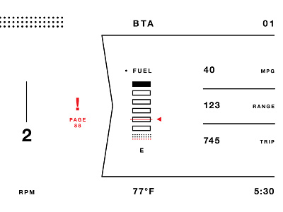
There was a number of error lights going off, but I couldn’t locate them in the manual. I wish my car had an error warning which told me a code or exactly where in the manual to find more information.
I also hate the ugly color palette and unnecessary clutter and information my car presents to me. This is by no means the best solution, but I hardly ever see UI mockups of car dashboards that have any sense of restraint.
Not sure this would work in the real world as it currently sits, but I think something in this direction would be a welcome change.
I picture the dots above the speed changing color depending on how hard you are accelerating to be a visual cue to your gas consumption.


