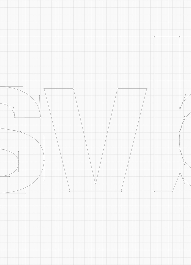
SVB - Rebrand - Logo Construction

Silicon Valley Bank
The Rebrand
Silicon Valley Bank has supported founders and entrepreneurs for 40 years. SVB has become the gold standard in funding for venture capital firms and tech startups. We updated the brand to confidently address founders and to unify the enterprise brand. In the brand update, we carried the strategic platform into the new visual identity by creating design principles: “Forward, Vision, Optimistic, and Expert.” The new brand expresses SVB's entrepreneurial expertise and confidence as leaders.
At the center of the updated brand identity is a new logo. Previously written out as “Silicon Valley Bank,” the “svb” acronym aligns the company name with shorter names commonly seen in tech. The forward chevron shape shows an ambition and relentlessness in pursuing goals. The light blue captures the optimism of fueling innovation for a better world.
The color palette represents the bold strategy through a streamlined set of colors that are vibrant and fresh while maintaining familiarity to the brand's heritage. Neue Montreal is a versatile font that is designed to work beautifully and efficiently at all sizes. It's a workhorse typeface making headlines and paragraphs both legible and elegant. The forward pattern is born out of the logo symbol, relentlessly pushing ahead.


