Daily UI 005: App Icon (Keep Notes)

Re-Designed an App Icon
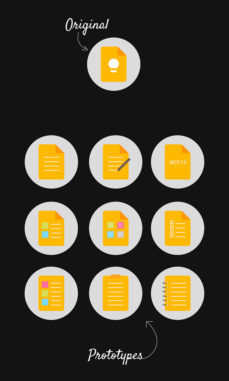
The original app icon (Note Keeps) did not effectively communicate the purpose or function of the app. It featured a bulb icon in its center, which is more associated with ideas or creativity rather than note-taking or organization, making it hard to be recognized.
In redesigning the app icon, I created 9 prototypes a more straightforward and recognizable design that clearly conveys the idea of note-taking or organization. This could help improve the logo's effectiveness in representing the app and attracting users.


