Megaclinic - Rebranding project


A rebranding project done for a laboratory and policlinic in Subotica, Serbia.
Their initial branding, the one they’ve uses for the past 20+ years, needed a visual refresh:

Since this was a transitional rebranding, we needed to create a visual system first and then redesign the logo at the very end of the process.
To be fair, this reversed process has proven to be challenging, since I’ve had to fit the old logo with the new concept, but we did manage to make it work.
Therefore, my starting point were colors.

The main green and lime colors was the pretty much the one they’ve used before. Reason being - Subotica is not a large city, it’s multiethnic and people are not very prone to changes. Not to mention that vast number of Clinic’s users are old people.
Those were the reasons we needed to keep it as visually similar to the established branding as possible. We needed to convey that this is the same Clinic it has been for the past 20+ years, but evolved in 2020+ era.
Besides the original colors, white was thoroughly used, even if not defined as part of the branding. And the addition I needed was a darker shade, therefore I added a Dark Green, to settle further purposes.
From this point on, I’ve cut the simplicity.
I wanted to take this Clinic on a trip, pull it’s flat elements out and make them float.

Based on the palette, gradients were made to cover the three states and tie the polyclinic, knowledge and laboratory into a singe entity.
Then, I needed to define how those floating element behave when the icon-set is added into the mix. Pictograms were a big part of the whole visual system.

And once the gradients and shadows were in place, I could apply that to all departments.

Megaclinic has different departments, their social channels communicate different things tied to a department by sharing different knowledge-points.


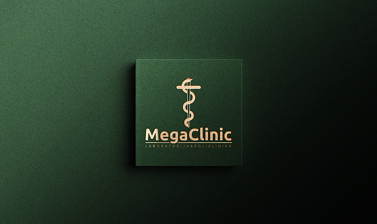
Logo
To create a visual balance, I needed simplicity in typography.
I’ve developed a logo set for long and short purposes, for whether the clinic needed to communicate it’s full name and fields of expertise or if it was enough to simply use it as a visual element on a page.

Symbol was then redesigned, as a modern approach on the classic medical motif, combining a serpent and a sword - a part of the clinic’s branding for the past 20+ years.
The serpent, a symbol of healing and renewal, entwines around a sword, representing precision and protection. This fresh emblem underscores the clinic's dedication to innovative healthcare and its role as a guardian of their patient’s well-being.

Application


This was an excellent collaboration of several years with a great clientand I’m happy with all of the things we’ve done together.
Although they ultimately chose a different logo for the rebrand,it was integrated within the foundational system we established.
Over time, we got to a point where their needs needs diverged from the scope of my expertisewhere our collaboration has naturally concluded.
The project now lives on as it was envisioned. ⚕️


