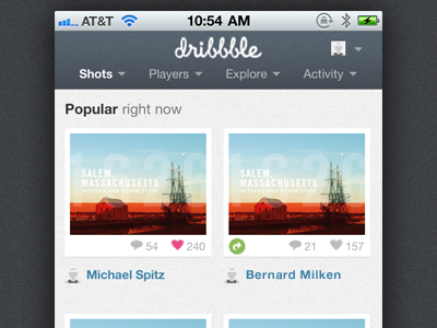
I feel like the nav bar could be a little taller and more fat finger friendly, but I will take whatever I get for a little better experience on the go, well done guys.
Very good job with this. I love the simplicity of the change, and how light the page feels when scaling. Only gripe I have is that the text is a bit too small. But that's just me.
Excellent job, you guys!
This is great! Only critique is on the large noisy footer and the ad. I feel like the ad should be above the footer and not in the middle of the content. Or the ad should disappear ;)
65 Responses (page 1 of 3)
The adaptive styles for screens <480px is out there and running. We hope that firing up Dribbble in a smaller screen is a much better experience now.
We could go further, of course. But for now, it's a vast improvement when dribbbling on the go. Enjoy!
almost 2 years ago
Awesome!
almost 2 years ago
I feel like the nav bar could be a little taller and more fat finger friendly, but I will take whatever I get for a little better experience on the go, well done guys.
almost 2 years ago
Coooool
almost 2 years ago
Awesome! Only gripe is no retina graphics, but I can live with that. lol
almost 2 years ago
Yes!
almost 2 years ago
Dribbble is on my iPhone's home screen now. Love it!
almost 2 years ago
Yeeeeeeah baby!
almost 2 years ago
Very good job with this. I love the simplicity of the change, and how light the page feels when scaling. Only gripe I have is that the text is a bit too small. But that's just me.
Excellent job, you guys!
almost 2 years ago
Beautiful love the design
almost 2 years ago
Much nicer, it was a welcome change when I opened dribbble earlier today; much easier to use without losing any functionality. Thank you!
almost 2 years ago
— Niiice!
almost 2 years ago
Nice! But where do you sign in??
almost 2 years ago
Love it ! Even more because one of my shot is on the screen :)
almost 2 years ago
So great!
almost 2 years ago
Love it! Been waiting for this for quite some time ;D
almost 2 years ago
I absolutely love it. Only criticism is far too much noise on the background!
almost 2 years ago
Very nice!
almost 2 years ago
Nice work!
almost 2 years ago
Wonderful!
almost 2 years ago
This is great! Only critique is on the large noisy footer and the ad. I feel like the ad should be above the footer and not in the middle of the content. Or the ad should disappear ;)
almost 2 years ago
Is this just media query?
almost 2 years ago
BOOM.
almost 2 years ago
Finally! Loving this, a great addition to dribbble.
almost 2 years ago
Bam! I likey!
almost 2 years ago