Find designers
Designer search
Quickly find your next designer
Post a job
The #1 job board for design talent
Inspiration
Courses
UX Diploma
Learn UX design from scratch in 6 months
UI Certificate
12-week UI skill building for designers
Live interactive workshops
with design professionals
Jobs
Go Pro
Log in
Dribbble: the community for graphic design
Advance your career with a Professional Diploma in UX Design
Learn more
Log in
Sign up
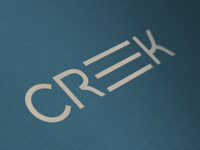
Creek
Mackey Saturday
Follow
Following
Like
#345767
#3E6C81
#ADA89E
#7D8482
Download color palette
Second part of a word mark for a company I can't yet disclose the identity of.
fun
identity
logo
typography
View all tags
Posted on Aug 17, 2011
6,293
24
184
28
View feedback
Mackey Saturday
Identity design the world can believe in.
More by Mackey Saturday
View profile
Previous
Next
Loading…