Name. Logo. Restaurant. Beacon


Hi friends 👋
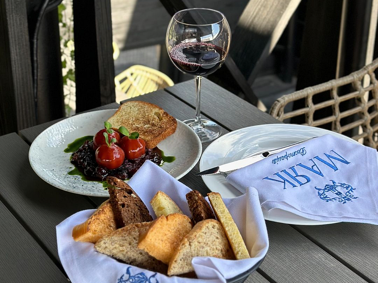
Check out my logo design for @mayak_restoratsiya ❤️
The inspiration came from the plant ornaments of Sanderson wallpapers and the Wenzel (from Polish «wezel» - «knot») initials of personal names. They differ from monograms by a complex intertwining of initials, adding various decorations, patterns, and whimsical designs. This adds structure and sophistication, as well as combines historical connection with modern design.
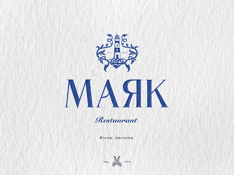
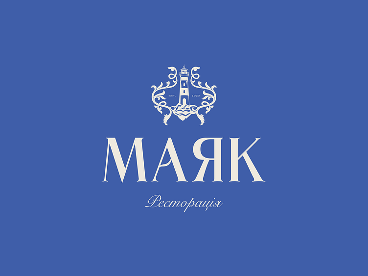
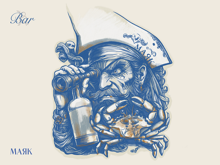
The main symbol of the logo is the image of a lighthouse, which is a key part of the brand concept. This lighthouse stands as a coastal guardian, pointing the way and giving direction. It symbolizes both discovery and safety - these values are at the core of the «Beacon» activity.
The letter «A», which is the main decoration of the font part of the logo, symbolizes the movement of a wave. This playful interpretation adds dynamism and liveliness, reflecting the idea of motion, inspiration, and infinity.
The Pantone 2388 U color combined with Pantone 11-0701 TCX Whisper White adds energy and inner peace to the logo. This harmony of colors reflects the connection with nature and modernity.
The «Beacon» logo conveys the brand's meaning through a refined ornament, a symbolic lighthouse, and graphic details that create a unique image, reflecting the essence of the @mayak_restoratsiya
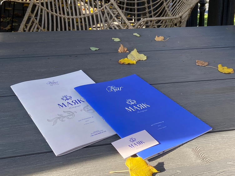
Four elegant versions of the typographic part of the logo were masterfully crafted, accompanied by an extensive collection of unique stamps.


Sharing a glimpse of the process with you
instagram: http://surl.li/scavl
Presenting one of the 15 illustrations I crafted for @mayak_restoratsiya ✨ «Beacon» became my main companion in this journey. Fast-paced, instant decisions, and relentless effort – sometimes it’s a real thrill! 🚀
Hope you love it! 💫
Hope you love it! 💫
Projects 📩
Let's Connect 👋


