Gravatar_big

Grandesque Caps

Grandesque_q3

19 Responses

  1. Pro Gravatar_big Julian Hrankov

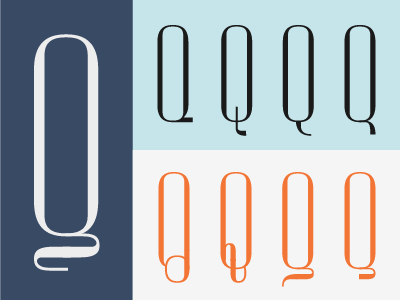
    I started working on the caps for my font »Grandesque«. Having a lot of fun with the various possibilities for the Q.

    Comments welcome as always. Which one do you like best?

    10 months ago

  2. Pro Finalforreal Luke Ritchie

    Nice, Dig the one on the left the most :)

    likes

    10 months ago

  3. Pro Asset-dribbble Rich Baird

    I agree the big one on the left is lovely.

    10 months ago

  4. Square Dan Eden

    Left here too. It looks a little like O forgot to tie it's shoelace.

    10 months ago

  5. Dribbble Dario Calonaci

    Big left, but in the third version on the small row, the one with one less curve...seem more equilibrium IMO

    10 months ago

  6. Pro Photo Russell Bishop

    Big left and second to last (near bottom right) are my favourites - very nice work!

    10 months ago

  7. Pro Avatar Everyone Knows

    third one in the orange row. Call me oldschool. Yeeeeaaaah

    Alex

    likes

    10 months ago

  8. Pro Philipp datz Philipp Datz

    never saw a q like the first on in second row, but i love it. aa makes problems on the vertical line though :–(

    10 months ago

  9. Pro Seanwes-typographer Sean McCabe

    Also wanted to vote 3rd in orange row.

    10 months ago

  10. Avatar Joel Derksen

    I'm kind of digging the 2nd one on the left, in the orange row. But i'm not sure if it's reading well as a Q yet.

    9 months ago

  11. Admix_designs_avatar_for_dribble-01 Joe Prince

    Wow Julian, those are all gorgeous man. I've found that the letter 'Q' has so many possibilities and is extremely fun to play around with. That being said, my favorite is definitely 3rd from the left on the orange row. It has just enough class and appeal but doesn't seem like it would impede the rest of the characters around it. I also am very fond of the 4th one from the left on the blue row - that thing is stunning :)

    Can't wait to see more of this beautiful font, keep me posted. Cheers.

    likes

    9 months ago

  12. Pro Logo_no-whitespace Alex Sheldon

    Some of these read as a "G" at a glance. My favorite is the orange, second from left. The problem with this one is it may loose effectiveness at smaller settings. You should add the glyph over it too as a solution let people access stylistic features. Nice work!

    likes

    9 months ago

  13. Mabu_avatar Mads Burcharth

    Holy moly. The lefty and the second last one is fantastic.

    likes

    9 months ago

  14. New-avatar_normal Steve Randy Tantra

    The last of the orange row for me.

    9 months ago

  15. Pro Thumb80 Claire Coullon

    These are stunning - the variation is seriously impressive. I love the one on the left. The light blue series is a nice, more restrained direction too - the second one from left looks like an 'O' playing golf. Good luck deciding!

    9 months ago

  16. Pro Jks stamp John Kane Smith

    Those are some damn nice Q's. I like the big jam the best...

    9 months ago

  17. Pro Avatar Paulius Kairevičius

    ^I am with you John :)

    8 months ago

  18. Admix_designs_avatar_for_dribble-01 Joe Prince

    First of all, this is still badass after looking at it again. Second, where the hell have you been man and how is the progress of this font going?

    likes

    6 months ago

  19. Pro Gravatar_big Julian Hrankov

    I appreciate it, Joe. I'm doing good, university keeps me pretty busy but there's more stuff coming from me soon.

    The font is coming along slowly but surely. Can't quite figure out how you're churning them out at the rate that you do :)

    likes

    6 months ago

keyboard shortcuts: previous shot next shot L or F like