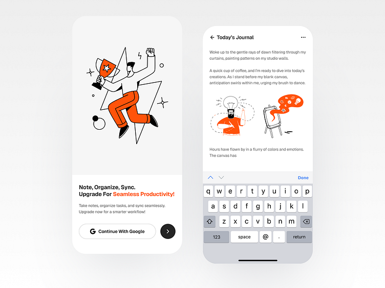
Minimal Notebook App UI Design

Creating a notebook app...
that stands out in the crowded digital landscape requires a harmonious blend of user experience (UX) and user interface (UI) design principles. In this detailed exploration, we delve into the intricacies of designing a notebook app that caters to both iOS and Android platforms, ensuring a seamless and engaging experience for users across devices. This comprehensive guide covers every aspect of notebook app design, from conceptualization to execution, highlighting the importance of UX/UI design in crafting applications that resonate with users.
Conceptualization and User Research
The journey of designing a notebook app begins with a deep understanding of the target audience. User research plays a pivotal role in uncovering the needs, preferences, and pain points of potential users. By employing techniques such as surveys, interviews, and user personas, designers can gather valuable insights that inform the app's design direction. This initial phase is crucial for aligning the app's features and functionality with the expectations of its intended users, whether they are students, professionals, or casual note-takers.
1. Simplicity and Clarity
At the heart of a successful notebook app is a simple and clear UX design. Users should be able to navigate the app intuitively, without needing extensive tutorials or guidance. This means designing a logical structure that organizes notes, notebooks, and tags in an easily accessible manner. Simplicity also extends to the app's features, ensuring that users can perform essential tasks such as creating, editing, and organizing notes with minimal effort.
2. Consistency Across Platforms
Whether users are on an iOS device or an Android smartphone, the app's UX should remain consistent. This consistency encompasses everything from navigation patterns to interaction gestures, providing a familiar experience that reduces the learning curve for users switching between platforms. Designers must adhere to the specific design guidelines of each platform (Apple's Human Interface Guidelines for iOS and Google's Material Design for Android) while maintaining the app's unique identity.
3. Accessibility and Inclusivity
Designing for accessibility ensures that the notebook app is usable by everyone, including users with disabilities. This involves implementing features such as adjustable text sizes, color contrast options, and voice input capabilities. An inclusive design approach also considers the diverse needs of a global user base, offering multilingual support and cultural sensitivity in the app's content and presentation.
Designing a notebook app that excels in both UX and UI requires a meticulous approach that puts the user at the center of the design process. By focusing on simplicity, clarity, and consistency, and by incorporating visually appealing and interactive UI elements, designers can create a notebook app that meets the diverse needs of iOS and Android users. Through continuous testing and iteration, the app can evolve to offer an even more refined and enjoyable note-taking experience, solidifying its place in the digital toolkit of users worldwide.
Have an exciting idea but don't know what to do with it?
Kamrun Nahar
Press: “L” to show some love 💗
Interested in working with us? Send us a message: knahar.kamrun@gmail.com


