Amanda McQuade.Studio Brand

Amanda McQuade. Studio is an independently owned and operated design studio in North Carolina that is focused on delivering unique design solutions. Amanda McQuade. Studio needed a simple branding kit that conveyed reliability as well as playfulness to establish the studio as a reputable design studio.
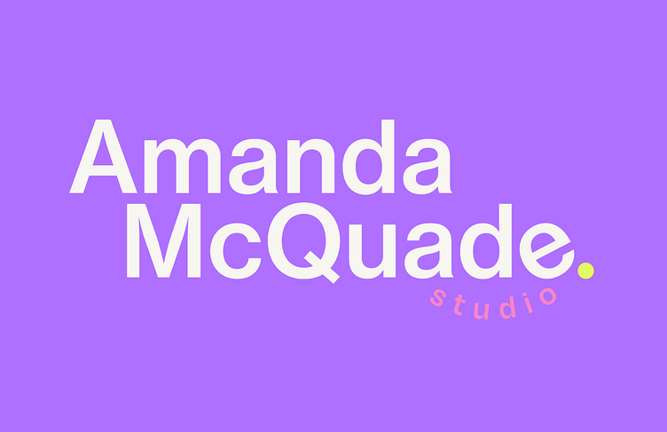
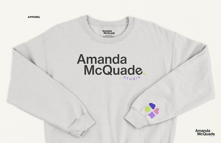
The goal of the logo was to be simple, yet approachable. Combining a strong, color-heavy sans serif with the use of Neue Haas Grotesk with small uses of bright colors and slight details such as the tilted “e”, placing “studio” in a smile-like form under “ade”, which was a play on “studio-aid” as I am both a freelance designer, but also an aid in placing clients in the process of re-configuring their branding idenity. Playful details interlaced with strong and simplistic letterforms form the combination between reliability and strength with the playful undertones of the creative solutions that are ideated in the studio for clients.
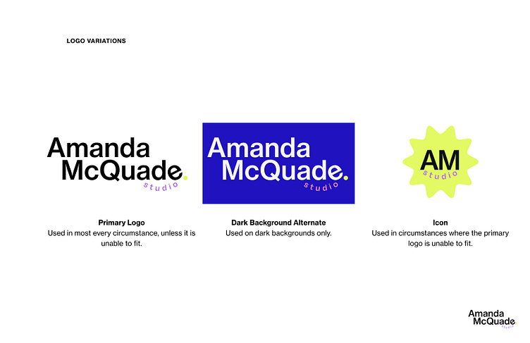
The logo consists of the classic primary and a small icon for limited use cases. Since my personalized logo had limited use cases already, there was not a need to overcomplicate its use cases beyond a variation for dark-colored backgrounds and a small badge icon that will be used sparingly.
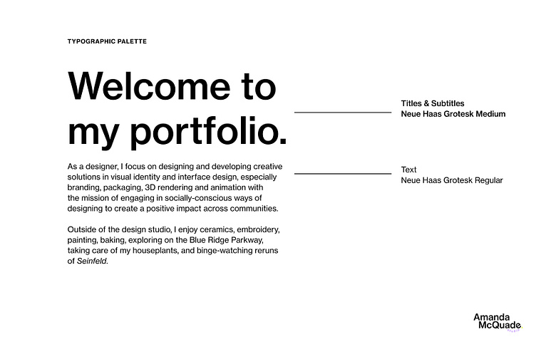
Utilizing a very simple typographic palette, Neue Haas Grotesk is utilized for a very clean, uniform look that spans across all applications, including my portfolio, website, and resume.
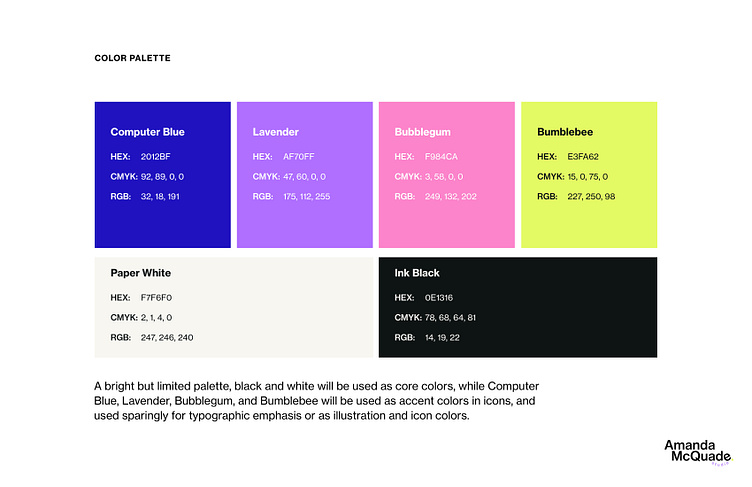
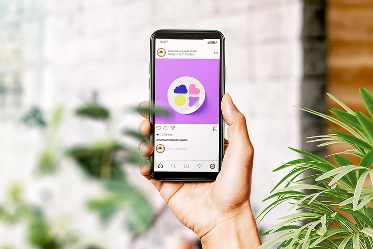
Amanda McQuade. Studio’s biggest flourishes emerge in the use of color. While mainly utilizing a black and white color scheme for simplicty’s sake, the fun risograph-inspired color palette adds a lot of fun and interesting personality into the branding identity. This color palette works well in a digital space, as well as intended for risograph spot color printing on printed matter. Eventually I’d like to get a risograph in the studio one day, and use these colors in printed materials as well for promotions.
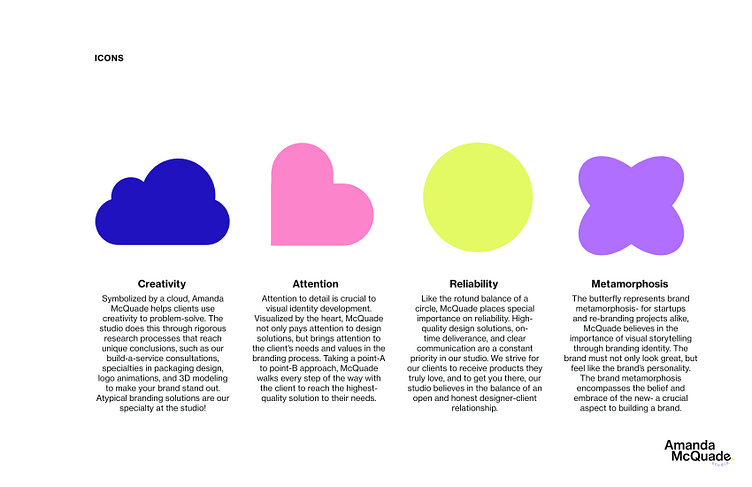
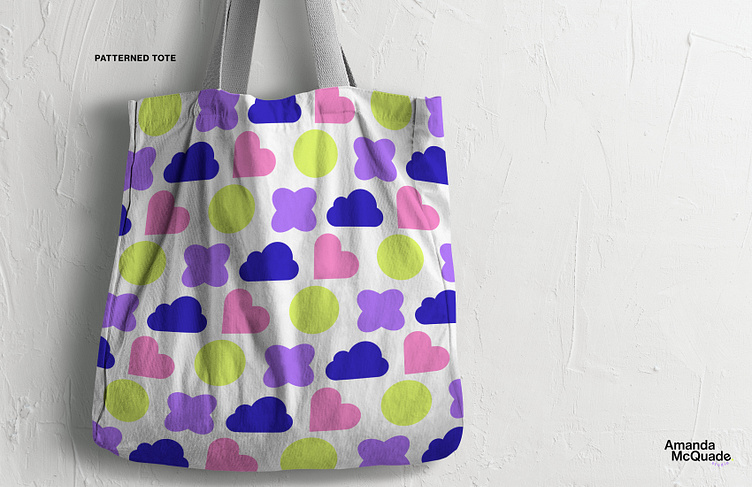
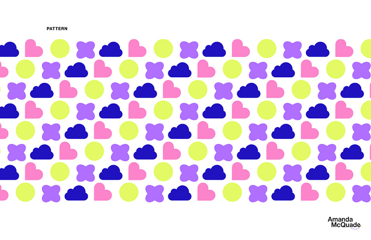
My icon system also adds fun splashes of personality into the identity, as well as being intended for later advertisement and marketing purposes such as explainer videos, printed matter, and apparel. These icons are not without purpose, as they encapsulate all of the important values I carry in my freelance client work. These icons were also utilized to create a limited-use pattern as seen.
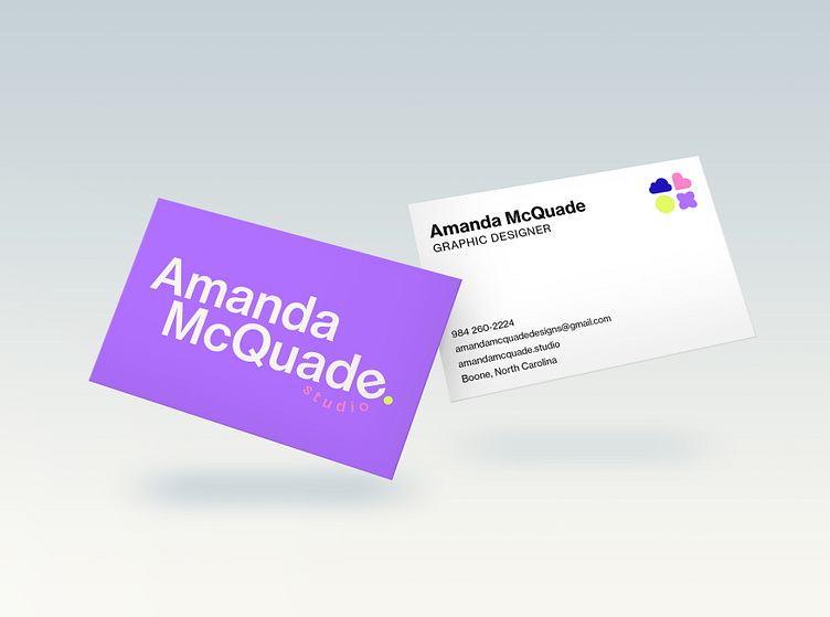
The branding kit is mainly utilized for studio promotion, especially in business card designs, apparel designs, and digital collateral for advertising.
Building a personal brand from scratch was a very daunting process, but turned out to be a very necessary exercise and made me think more about how to market my services as a freelance designer and what I’d like clients to know about my work, and myself.