Ample Florist Branding Graphic Design

Roles
Graphic Designer
Tools
Adobe Illustrator
Intro
Ample is a floral transportation and card company that gives customers the ability to send more than just flowers to their loved ones. Using their custom card and delivery service, users can send a standard message, or craft their own to accompany a beautifully arranged floral bouquet, perfect for any and every circumstance.
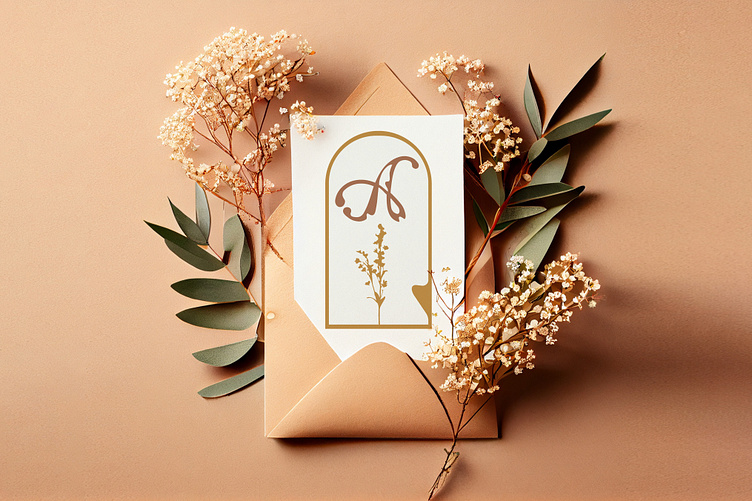
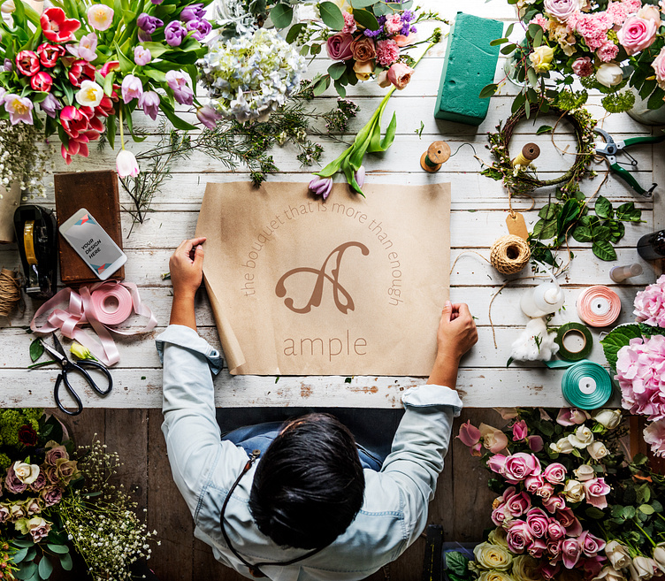
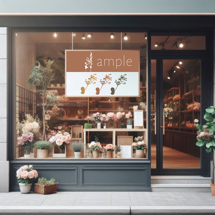
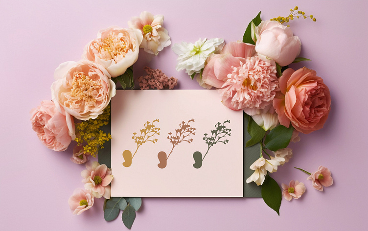
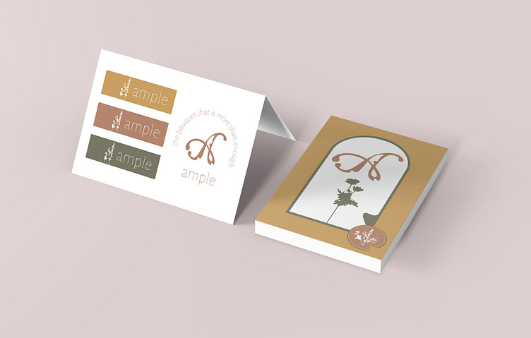
Below: Mockups of the Ample floral shop
Execution
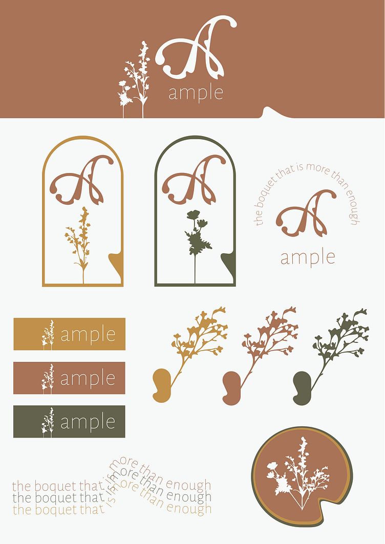
When designing the brand guide for Ample, my goal was to create a simple but interesting design that evoked nature.
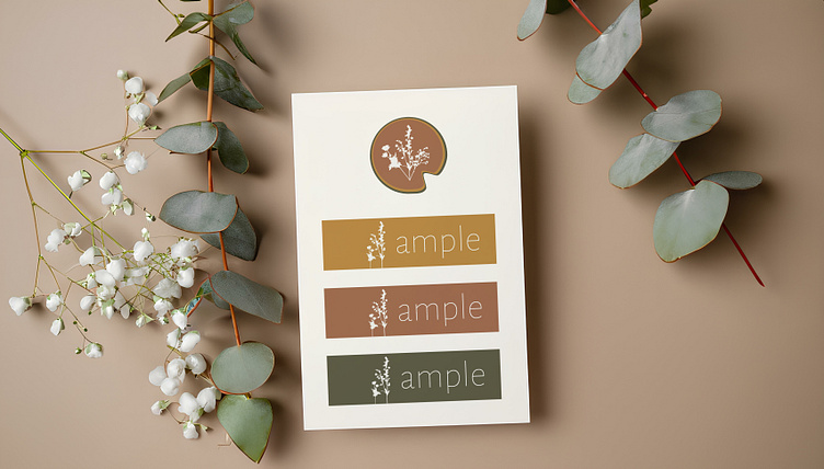
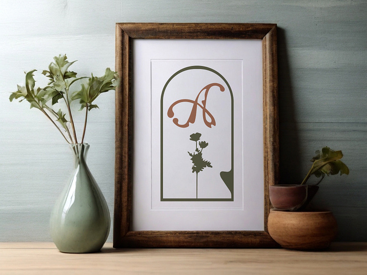
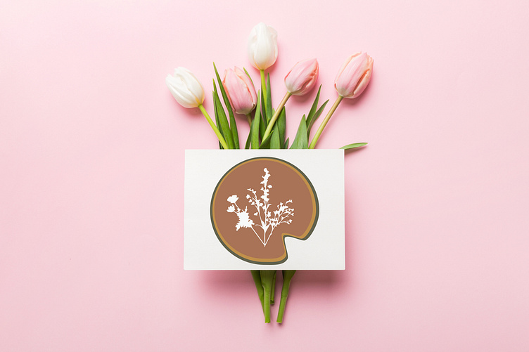
The main logo is based on an "A" that is curvilinear and dynamic, with small indentions along the script hinting to a natural wildness beneath an otherwise smooth shape. These indentions are repeated throughout elements of the brand guide, providing cohesion and reinforcing the naturally wild concept. Silhouettes of various florals nod to the purpose of the organization, and are entirely monochrome so as to not overwhelm the eye and detract from the main "A."
The color palette consists of a rustic orange, yellow and green. These colors are earthy and harmonize well both together and with a myriad of other natural colors that are likely to be found in a bouquet.
Below: Brand Guide
Below: Multiple mockups displaying the use and look of various Ample elements
While I was building this brand, I learned how minimalistic creative choices can benefit the look of a design more effectively than dramatic changes. I often want to capitalize on using as much creative freedom as I am able to, and appreciated the challenge of executing this project with a "less is more" mindset. If I had to re-do this design, I would rework the "A" in the logo to incorporate more of the word "Ample" itself, ultimately conveying the entire name of the brand in a single glance.


