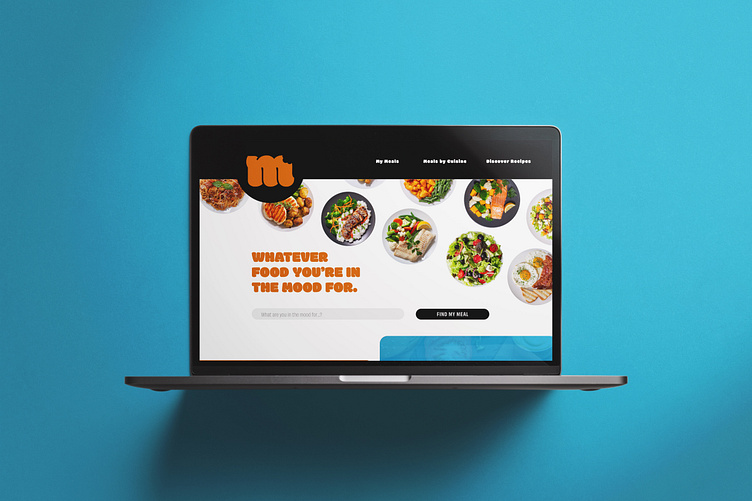
Moody Foody Website UX/UI Design & Graphic Design
Roles
UX/UI Designer, Graphic Designer
Tools
Adobe XD, Adobe InDesign, Adobe Illustrator
Below: Website Style Guide
Below: Various displays of the Mood for Food landing page
Proposal
Challenge
How might I provide a platform users can use to find restaurants that sell the exact meals they want, curated to their dietary, monetary, and geographic restrictions?
Key Objective
Moody Foody should enable users to search for food by the meal rather than the restaurant or cuisine. Because not all restaurants provide all encompassing menus, Moody Foody should stand out by allowing the user to narrow their search using the specific meal they're in the mood for. After interacting with the website, the user needs to feel they have been able to specify the exact dish they're looking for, and that the system gives free reign to easily implement various filters to narrow their results.
Solution
I created Moody Foody to provide users a straightforward platform where they can locate the exact meals they desire. I incorporated a filter that can be adjusted to dietary, monetary and geographic restrictions, along with visual inspirations for meal categories. Expanding off the most viable product, I added a recipe component where users could explore how to create the meals they desire at home, collaborate with other chefs, and broaden their appreciation of food. I ensured the website was designed holistically, considering both UX/UI development and branding concerns throughout the process.
Design Analysis
User Pains
Being hungry for a specific meal and not knowing where to find it
Going to restaurants only to find that the meal they craved wasn't there
Possessing dietary, monetary and geographic restrictions that inhibit them from eating at most places
Lack of awareness about what various restaurants offer
Wanting to eat in more but not knowing how to cook their favorite meals
User Desires
To eat the exact meal they want
To save money and not put themself at risk of health and financial complications every time they go out to eat
To possess a wider knowledge of the food layout in their geographic area
To explore different meals and cuisines
User Persona
An individual who loves food
Someone who is generally picky about what they want but doesn't know where to get it
Loves exploring different cuisines
Lives in a metropolitan or suburban area where lots of food options are available
Someone who loves to cook and tackles new recipes
Execution
A seamless platform where hungry users can quickly find the exact meal they're looking for using a filter search system
Hosts many filter options where the user can regulate their results in varying degrees of specificity
Provides results that show users what restaurants in their area offer the food they are looking for, where they are located and at what pricing points
A way to engage with other foodies in their area and discover new restaurants
During the design process of Moody Foody, I wanted to practice creating a landing page that coaxed the user to scroll beyond the initial screen in non-traditional ways. To accomplish this I added visually bright elements of sushi, burgers and donuts, and strategically altered their hierarchy to draw the users eye down the page from one point of focus to the next. I then incorporated this technique horizontally using both bagels and an image of an open book to grab the user's attention and invite them to continue exploring. The biggest obstacle I had in creating Moody Foody included crafting a visually stimulating UI that didn't overwhelm the user. I achieved this by maintaining a grid-like infrastructure which provided continuity and a stability that could support a wild range of color and imagery.
Below: The Moody Foody landing page
I personally really love the overall look of this page. It's vibrant, dynamic and full of information. I enjoyed thinking about graphic elements as conduits of movement and developing an aesthetic way of arranging them that was functionally successful as well. If I recreated this page, I would incorporate more descriptive text, and rearrange the first two sections to test how that affected user interaction and overall success of the website.


