Find designers
Designer search
Quickly find your next designer
Post a job
The #1 job board for design talent
Inspiration
Courses
UX Diploma
Learn UX design from scratch in 6 months
UI Certificate
12-week UI skill building for designers
Live interactive workshops
with design professionals
Jobs
Go Pro
Log in
Dribbble: the community for graphic design
Log in
Sign up
Haytercomm badge
Dusty Diamond
Follow
Following
Like
#F9F8F7
#D04729
#39312C
#6E3A22
#CBA9A1
#D38777
Download color palette
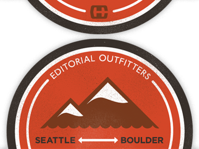
badge design for outdoor-centric PR firm
badge
distress
editorial
hayter
mountains
sticker
View all tags
Posted on Aug 16, 2011
1,270
8
53
5
View feedback
Dusty Diamond
More by Dusty Diamond
View profile
Previous
Next
Loading…