Original Grain Watches | CRO

Before I started wearing an Apple Watch as a full time job, I used to collect watches, so I have a healthy respect for their design. Original Grain has a natural mix of wood and steel that looks gorgeous, and as a value add, I isolated 6 quick wins for the website. See below for the breakdown!
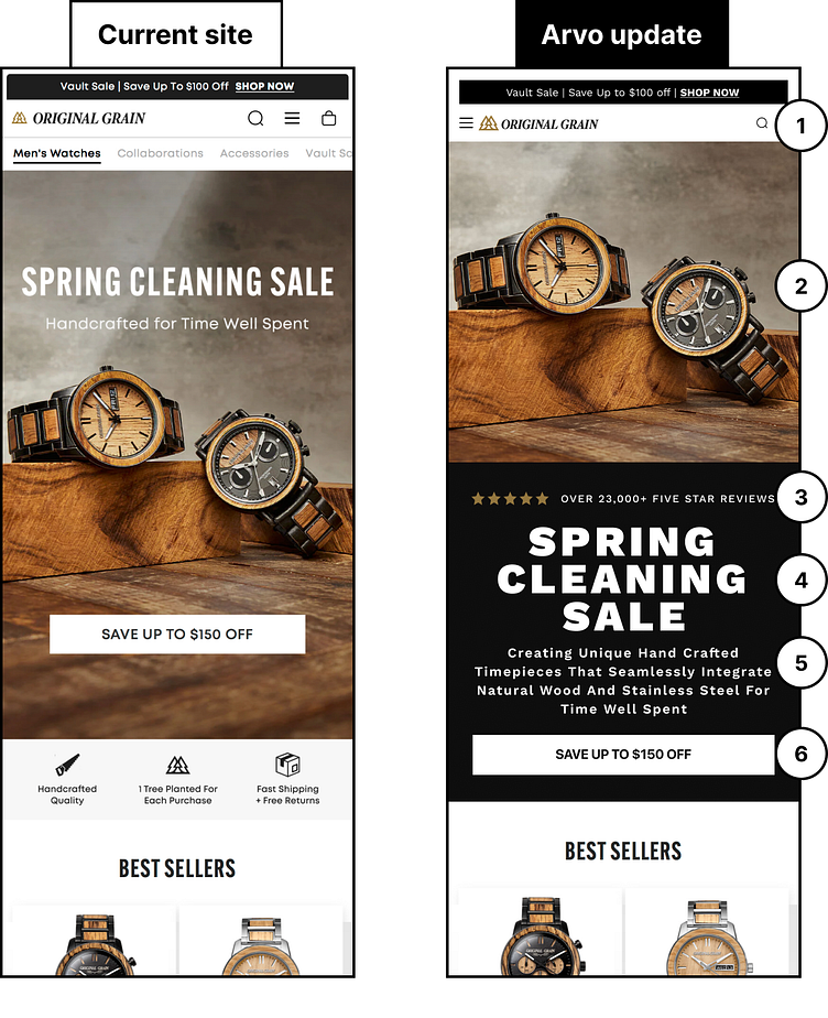
1) Try to keep key interaction button separated to reduce the risk of misclicks. Having two heavily trafficked buttons too close to each other can increase user frustrations. Instead try moving the hamburger menu to the left side of the logo.
2) Let’s separate the hero image from the hero text. Give users an opportunity to take in the visual information without any distractions. The hero image and hero headlines should both stand on their own.
3) Highlight your social proof by making it more of a focus in the hero section. Bring it above the fold so that users can see how other customers love your products.
4) Make sure to draw attention to your headlines by utilizing different font weights and font sizes.
5) Let’s expand on your business statement by including more details to help new users understand your products and business.
6) Make sure that your CTA buttons are full-width on mobile to ensure that they are easily clickable. Also add your shipping incentive to entice users to click and purchase.


