Hunter Properties

Hunter Properties is a real estate company specializing in helping clients find their dream homes. They approached me to create a brand identity that reflected their values of precision, strength, and guidance.
Design Goals:
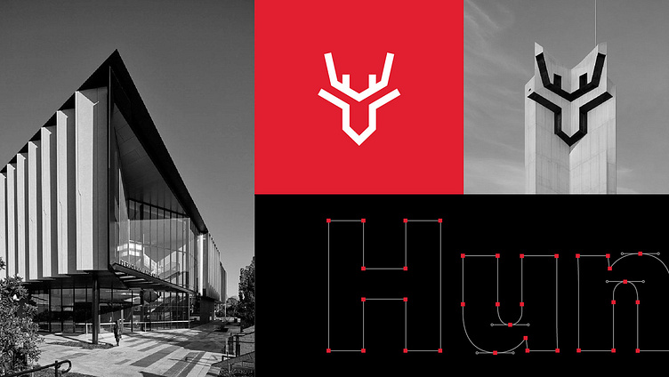
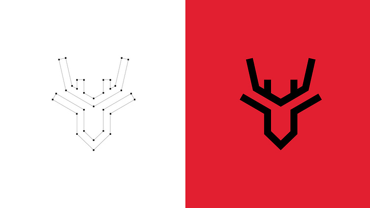
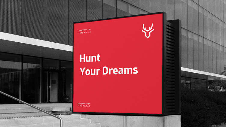
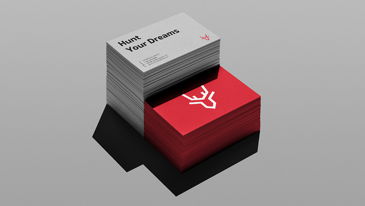
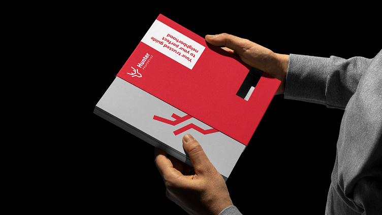
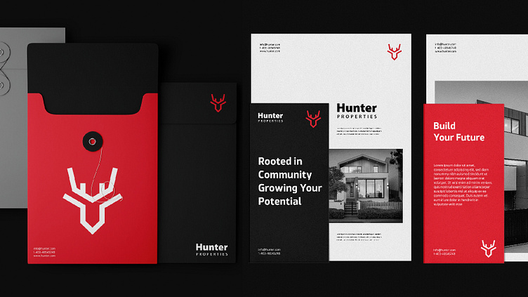
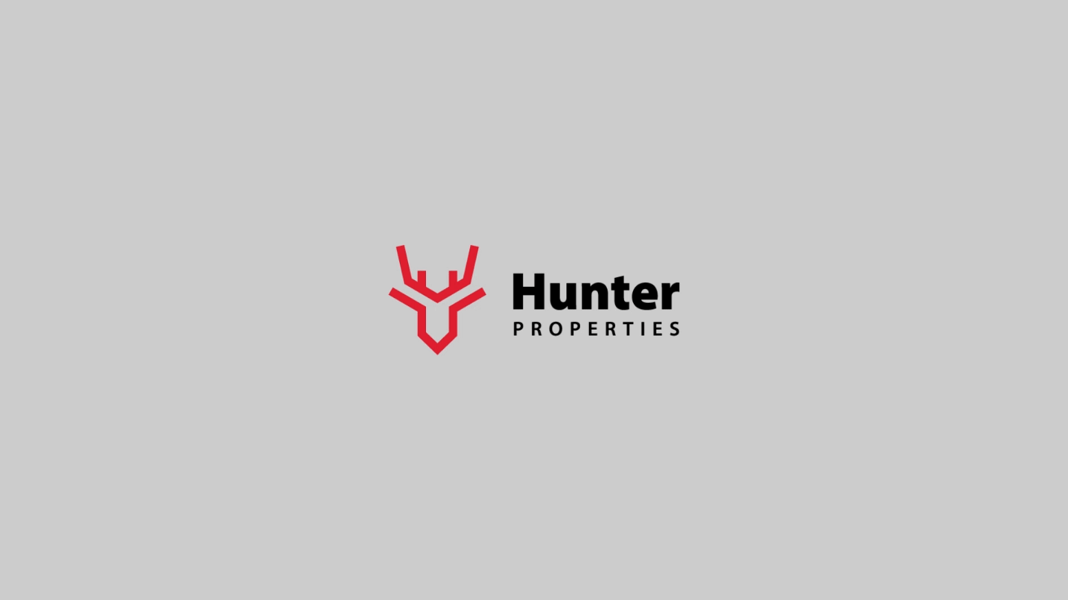
Craft a logo that combines a deer head silhouette with geometric lines to symbolize Hunter's focus and expertise.
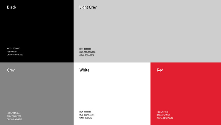
Develop a bold color palette of red (strength), grey (sophistication), black (elegance), and white (modernity) to convey their confidence and professionalism.
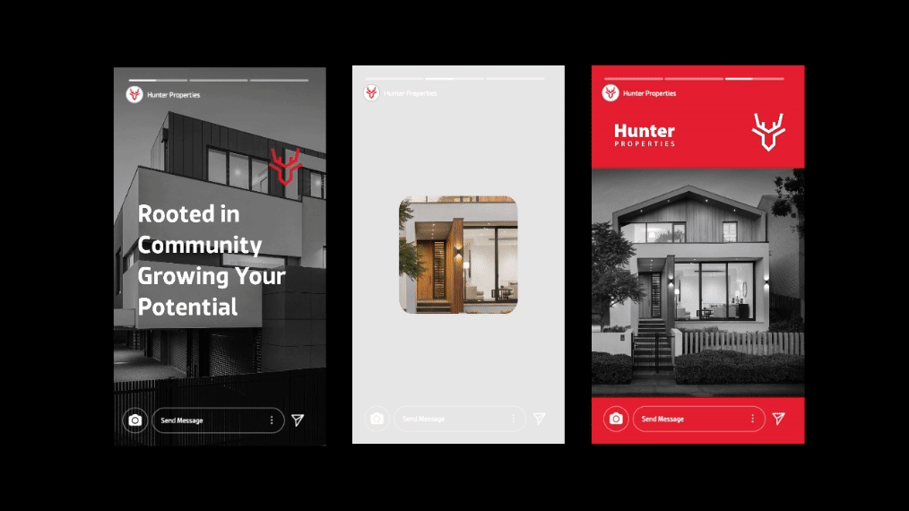
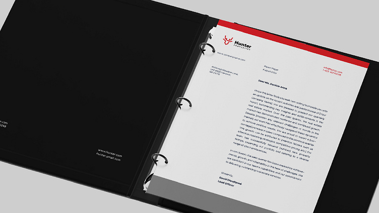
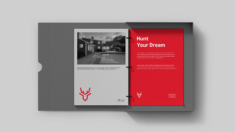
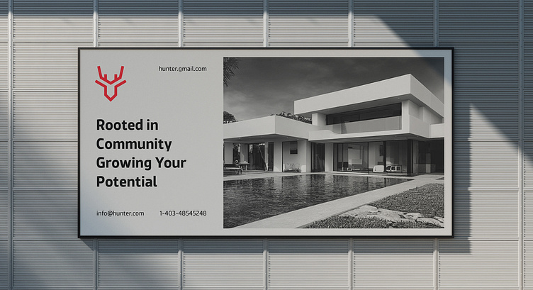
Create a cohesive brand identity system that extends to their website, marketing materials, and social media presence.
Solution:
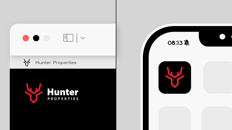
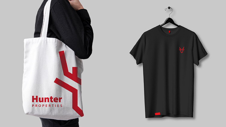
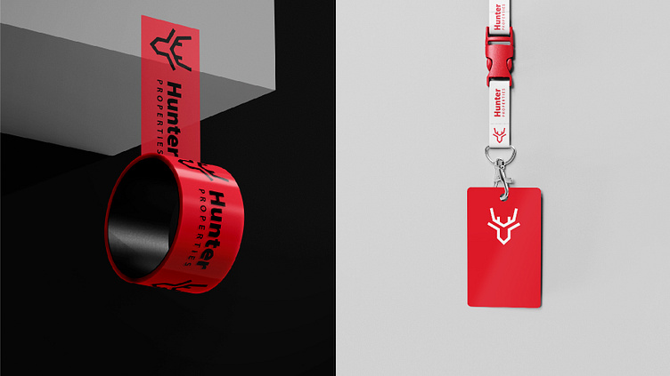
We crafted a minimalist yet powerful brand identity built around a deer head logo – a symbol of focus and direction. By incorporating geometric lines subtly within the silhouette, we added a touch of modernity and precision, reflecting Hunter's expertise.
The bold color palette of black and red exudes sophistication, authority, and action, aligning with Hunter's values and target audience. Grey accents add depth and dimension, while white provides breathing space and versatility.
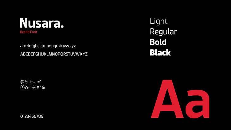
We chose a modern sans-serif typeface that complements the logo's clean lines, further communicating a dynamic and approachable approach.
Results:
The new brand identity has received positive feedback from both Hunter Properties and their target audience.