Shenzhen Bubble Tea

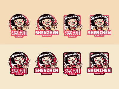
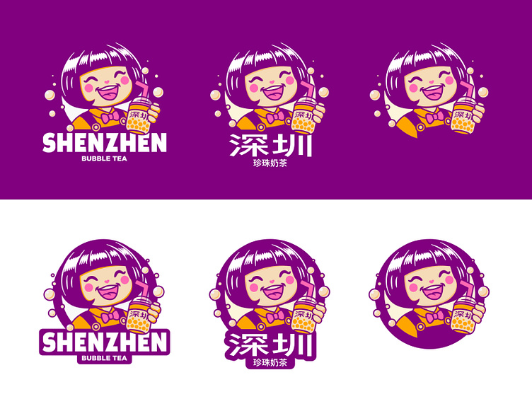
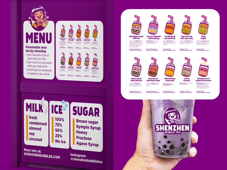
Create a memorable visual identity, which can be applied to a wide spread of applications ranging from the little kiosks which are seen all over the city streets, the menu, flyers, banners, social adverts, … to push traffic the sales of our Bubble Tea beverages.
Step away from the current bubbly typeface (bad for readability), yet make sure it's super clear we sell boba tea. Make sure to include a symbol-based logo of a bubble tea icon that we can use on our cart’s signage and menu. Ideally, the design can also be modified to represent different kinds of bubble tea types that have different milks, sugar levels, temperatures, and ice amounts.
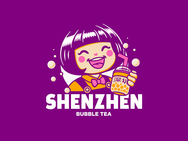
The branding needs to stand out of the crowd, and feel super-friendly so existing customers can recognize us after the rebranding. After all, our staff are well-known for their cheerful and helpful attitudes! It’s part of the reason why our brand of Bubble Tea is a family-favourite across Shenzhen, China!


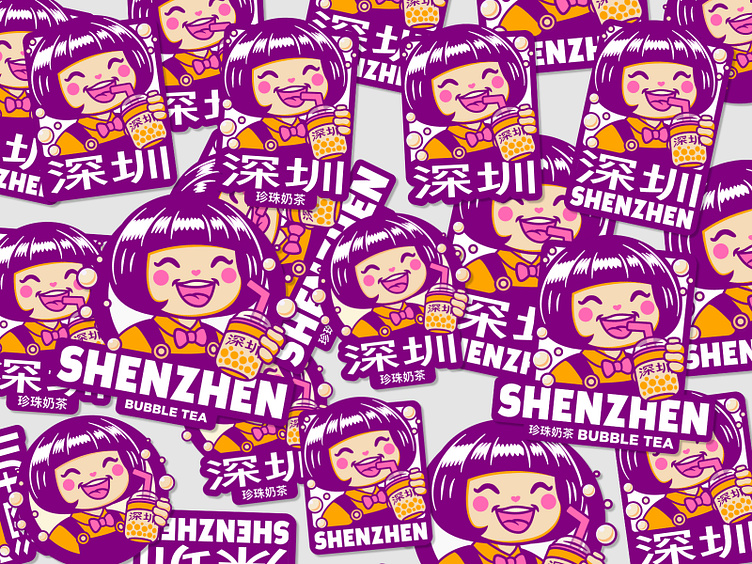
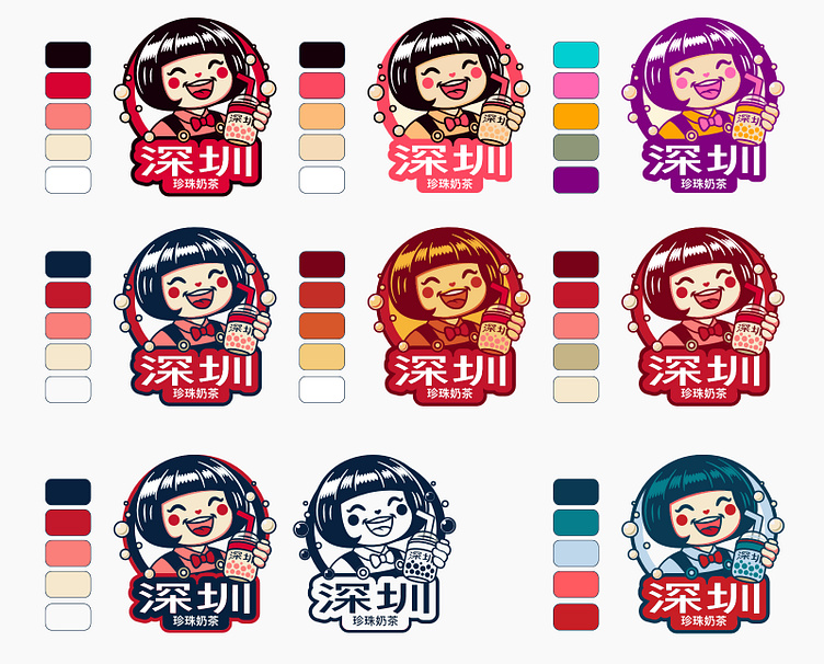
After testing a whole lot of colour palettes, checking countless art magazines, the portfolio of several of my favourite artists, and a wide spread of visual identities of big American brands — I became quite desperate and asked chatgpt. Sadly, I must admit, it looked too good to pass out on this colourful identity. What do you think, did I make the right choice?!