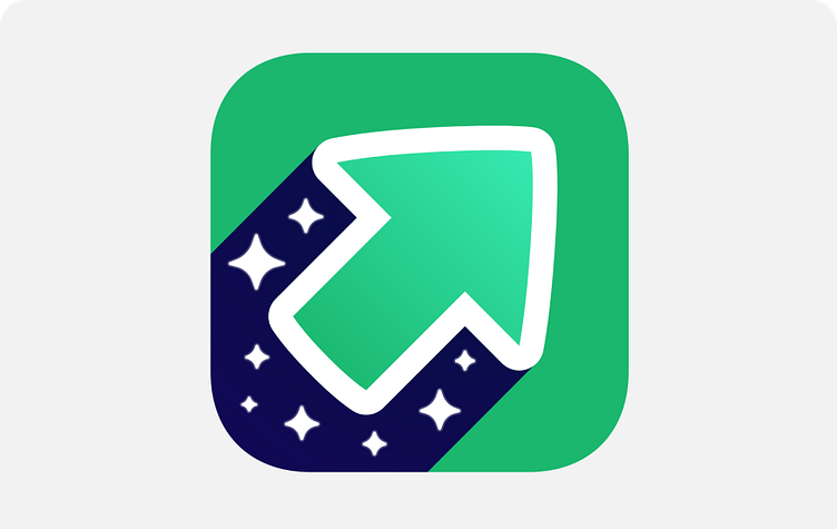
Imgur App Icon

Building a new entity for 300 Million: The Story Behind Imgur's Logo
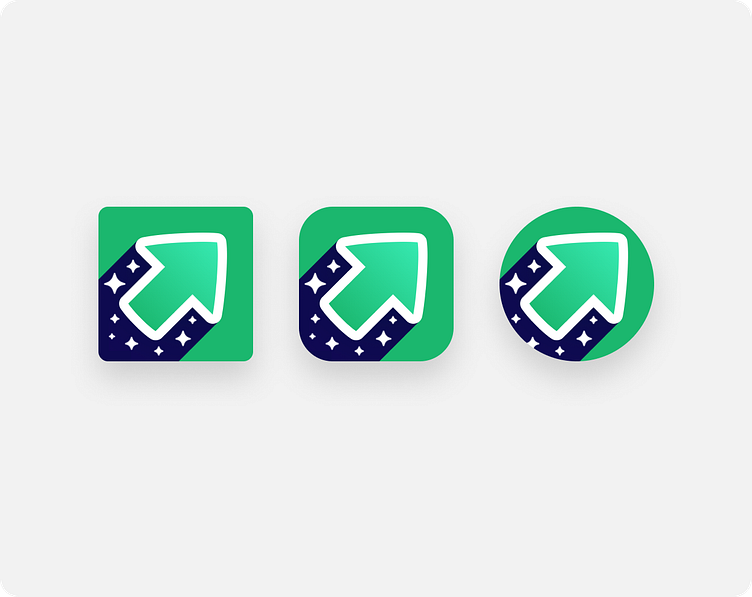
Taking on the role of Senior Designer at Imgur, I had the opportunity to lead a significant shift in our brand's identity. Moving from the familiar giraffe logo thats been around for years to a contemporary upvote symbol wasn't just a change in design; it was about aligning our visual identity with the company's vision and what our users value most. The upvote, a core feature widely used and loved by our community, naturally became the inspiration for the new symbol. This change made sense as it reinforced and built upon the relationship our users already had with the platform.
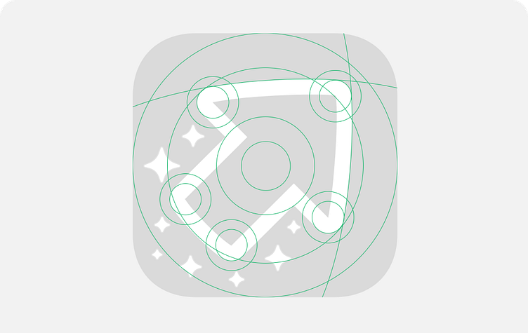
This project required patience, multiple iterations, and deep discussions to ensure the new design truly represented where we wanted Imgur to go. The transition aimed to more accurately reflect our focus on discovery, memes, GIFs, and the sharing of experiences among friends. Moving away from the giraffe was tough, as it had been part of Imgur's identity since 2009. However, it was necessary to correct misconceptions about our brand and to support our growth.
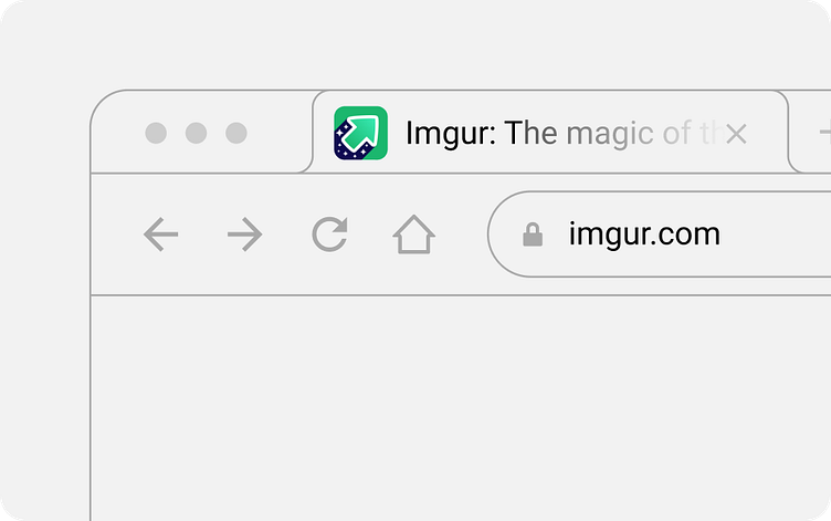
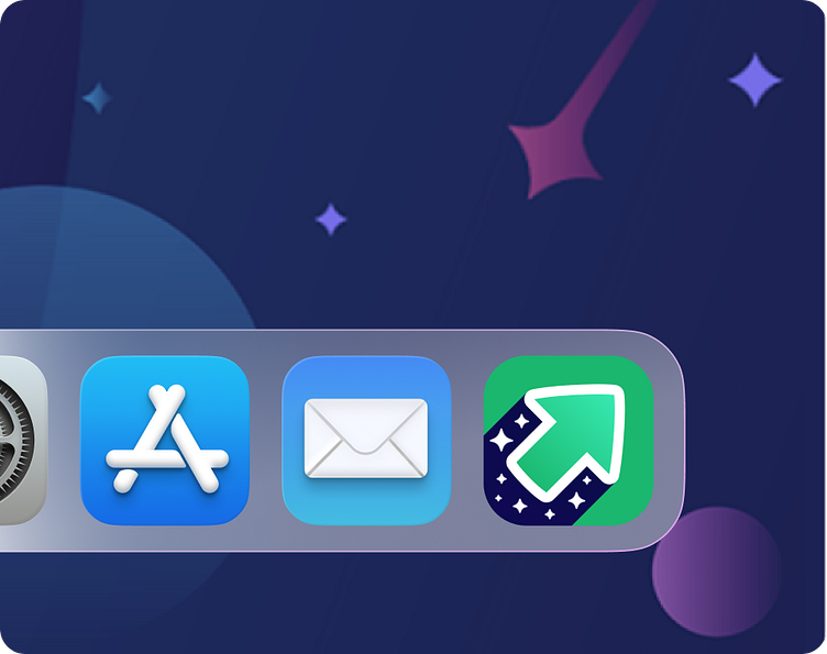
The redesign extended beyond the logo to include our mobile and web applications, improving the overall user experience. Working closely with the team, we managed to implement these changes efficiently, despite tight schedules.
The result was a refreshed brand identity that felt right for Imgur and resonated with our community. This experience stands out as a highlight of my career, offering unique insights into the impact of thoughtful design on brand evolution and user connection. Sharing this project on Dribbble, I hope to convey the value of aligning brand identity with user interaction and the importance of persistence and collaboration in achieving such a significant transformation.
Thank you all for reading and feel free to reach out if you have any questions.
Phil