The online cinema app

The story behind this shot
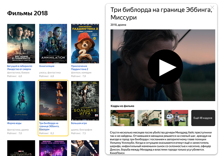
A few years ago, I was doing a test assignment for the guys from Yandex. As a task, such a screen 👇👇, and a request to "make it beautiful".
Thoughts behind this shot
At first, it was not clear what kind of product this was. Was it a Yandex service, or something independent? A web service or a stand-alone app? An application designed for TVs, tablets, or PCs? The assignment didn’t provide clear answers, so I relied on my own interpretation.
Considering Yandex's ownership of Kinopoisk, a platform similar to IMDB, I deduced that this interface was related to Kinopoisk. After giving it some thought, I decided it would be interesting to design an app for a tablet based on this information.
Furthermore, the assignment did not instruct me to preserve any poor user experiences that may exist. As such, it became necessary to consider the context of the screen's use and determine the specific point within the user journey it represented. This required a more granular examination of the interface’s architecture.
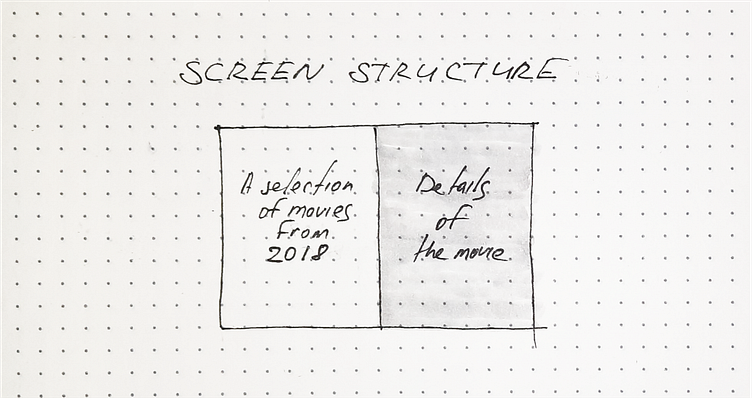
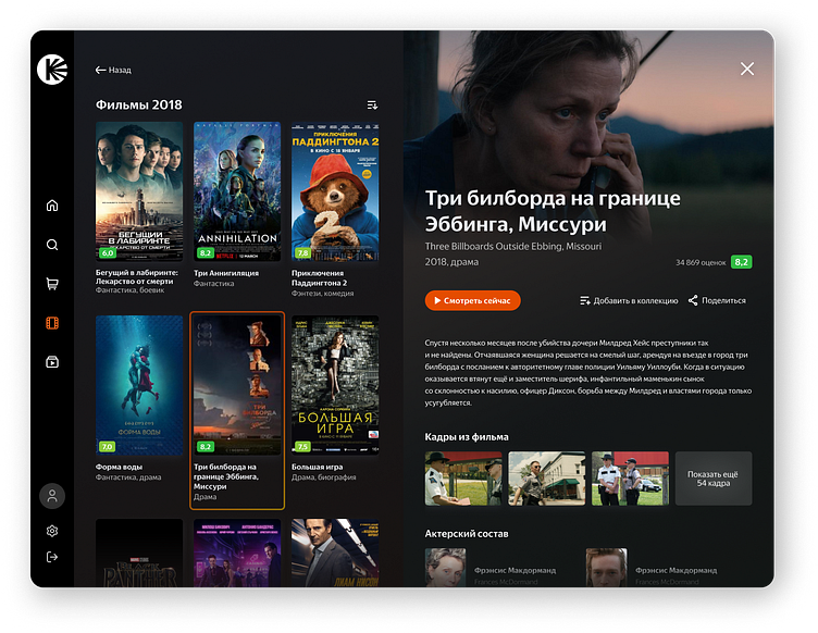
The left side of the screen layout displays a selection of movies from 2018, while the right side details one specific movie. The right side could be described as a pop-up window or sidebar, and the "play" button stands out. It's not entirely clear what this right-hand side offers, whether it's just information about a movie or a movie card for an online theater. After a little thought, I concluded that enhancing the UI for an online cinema would be a more interesting challenge, and this does not contradict the assignment.
The design
Initially, I tried to organize the user interface of the provided screen. Along the way, I added several features that I thought would be appropriate for a cinema app, such as the ability to save to favorites, share content, like or dislike content.
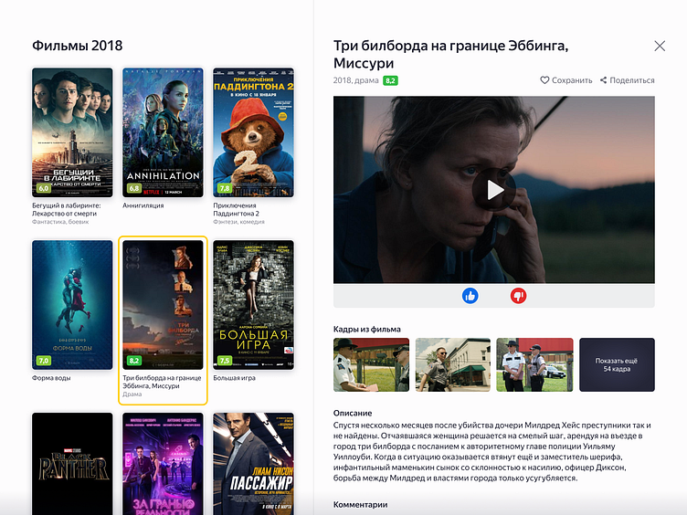
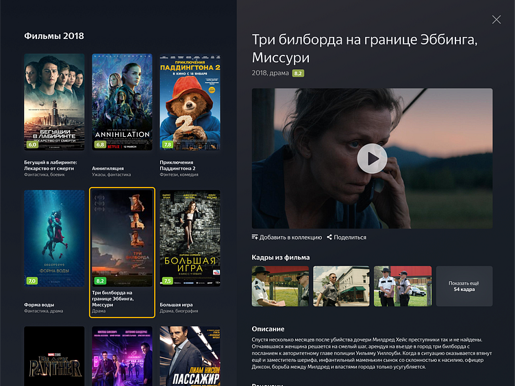
The inclusion of the likes and dislikes features raised some questions. Nevertheless, I decided to keep them for now. Moreover, the UI could benefit from a shift to a dark color scheme, as a dark theme resonates more with the cinematic experience. Indeed, visuals in a dark theme often appear more striking.
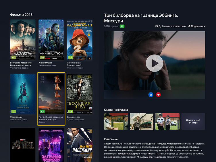
Viewing the screen from the user journey perspective, it seems likely that the user is in the midst of selecting a movie. Accessing the likes and dislikes at this juncture does not enhance the evaluation system. Logically, these features would be better suited for a post-viewing context, on a screen after the movie has been watched. Consequently, it makes sense to dispense with this evaluation system, especially since it wasn’t part of the original task's screen requirements.
The screen looks much improved, but it still lacks intrigue. I thought that displaying a movie trailer instead of the full movie in the video block might be more fitting. Since the movie could be pay-to-view, offering full access in this way may not be advisable. This change doesn't conflict with the "movie selection" scenario. I set the video as a background in the header of the right side of the screen (the movie card) and planned for this video to be a short, looping snippet of the trailer, which would auto-play when a movie card is selected.
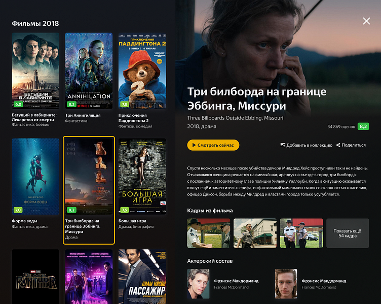
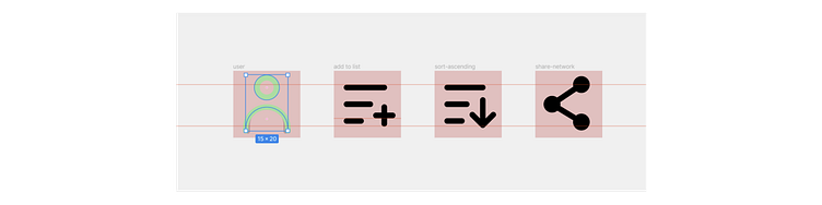
At that moment, I remembered that my goal was to design a tablet app, which would undoubtedly require a robust navigation system. I thought a Navigation rail might be well-suited for this purpose, given the app's functionality. Additionally, I reviewed the current Kinopoisk brand guidelines to ensure that the UI conformed to their established corporate identity. This alignment helped bring the design up to their standards. Finally, I created a small yet consistent set of icons to enhance user interaction and visually unify the application.
This is the final iteration of the UI that I have developed. To better illustrate the concept of auto-playing movie trailers, I've created an animation in After Effects that demonstrates how users can switch between various movie cards.