Blossom Website UX/UI Design & Graphic Design

Roles
UX/UI Designer, Graphic Designer
Tools
Adobe XD, Adobe InDesign, Adobe Illustrator, Adobe Photoshop
Introduction
Blossom is a bouquet building company that allows customers to personalize their floral arrangements for numerous events. Using Blossom, brides and event planners alike have the opportunity to explore different aesthetics and hand select various components they would like to see in their bouquets. With the goal of alleviating pressure on an already stressful but exciting component of an event, the ease of Blossom's bouquet building system encourages their customers to enjoy the process.
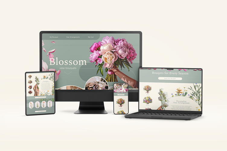
My goal in creating Blossom was to experiment with overall layout of the interface on the effectiveness of the user's experience. I wanted to lean into the floral, feminine nature of bouquet building, which informed my color decisions- ultimately landing on a pastel green, pink and creme color palette. I chose to incorporate floral imagery to reinforce the wildly beautiful nature of flowers, but also to inspire the user to envision the product they were creating. I chose to incorporate rounded shapes as a way of reproducing the organic essence of florals. Below are three versions of the same landing page, from least to most visually demanding. In exploring these layouts, I wanted to test the boundary between UI and UX to discover if a point existed at which the functionality diminished the aesthetic of the interface, or vice versa.
Below: landing pages in order from least to most visually demanding
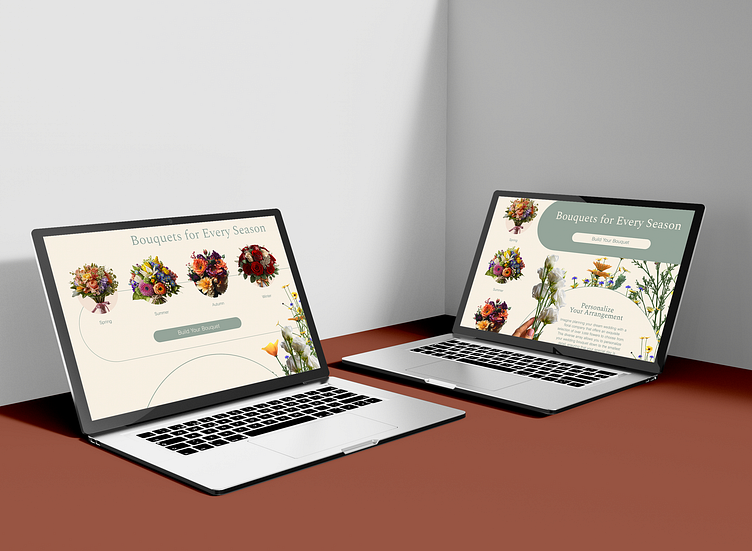
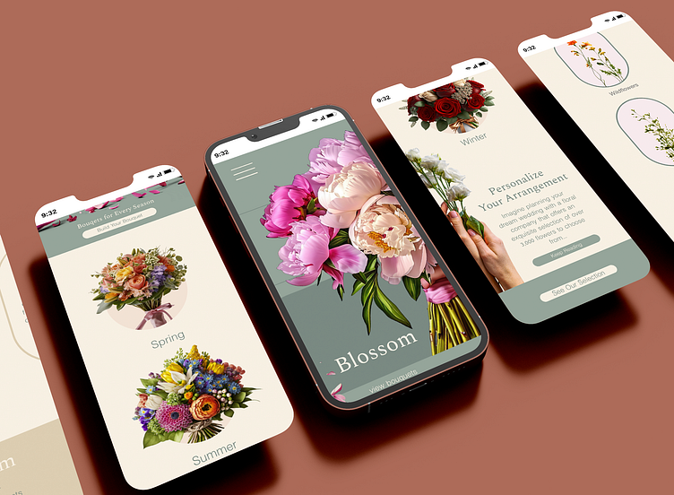
Below: various mockups of landing pages

Proposal
Challenge
How might I create a website that allows users to easily pick the best florals for their wedding events while visually evoking the idea of blooming into a new season of life?
Key Objective
Blossom should inspire brides to imagine holding the bouquet of their dreams, and then put that exact bouquet within their reach. It should allow users to search for the kinds of florals they want by type of flower and season so they can personalize their bouquet down to the last petal. After interacting with Blossom, the user should feel confident they picked the best floral arrangement for their event.
Solution
I focused on designing an interface that entirely revolved around the concept of blooming by incorporating numerous floral elements as well as wedding imagery. All of the imagery I selected was intentionally cropped to highlight either the flower of a variety of floral arrangements. The greens and pastels I chose yielded themselves to the idea of growth, while the vertical line of falling petals and stems were placed strategically to encourage user exploration down the page. I represented the categories of options (season and kind of flower) with vibrant imagery, and multiple CTAs to prompt the bouquet building process.
Design Analysis
User Pains
Overspending on flowers
Purchasing flowers that don't fulfill their expectations
Under informed on available floral arrangements
Under informed on seasonal flowers
Lost in an oversaturated market
User Desires
One platform where they can learn about and pick flowers that meet their desires
A way to pick every element of their bouquet easily and without confusion
The ability to swap and exchange certain elements of their bouquets to compare and contrast variations
To hold the bouquet of their dreams on their wedding day while staying within their financial boundaries
User Persona
Someone planning a wedding or event
Has an eye for aesthetic, appreciates controlling their own design
Isn't able to spend absorbent amounts on florals
Loves flowers but isn't informed on various types
An individual who loves bringing a vision to life
Execution
A site that has a visible breakdown of the elements that can affect the look of a bouquet, i.e. seasonal picks and plant types
Categories that funnel the user step by step into the bouquet building process
A profile page that allows the user to save bouquet options
A section that explains the motive behind Blossom
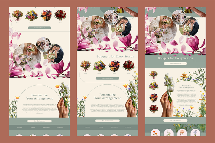
The following version of the Blossom landing page has the most visually stimulating interface. Falling petals encourage the user to scroll downward where they're met by wedding bouquet imagery that sets the stage for what they can expect to be holding. The user then moves to the seasonal section where a left alignment of categories leads them to sub pages of floral arrangements. On the right is a CTA and description of their ability to personalize their florals. This layout is atypical to the traditional grid and F structures, and therefore is the most ambitious in regards to the users experience navigating the page. Visually, it simultaneously provides both vertical and horizontal movement that balances the look and feel of the website.
Below: The first layout for Blossom

The following version of the Blossom landing page is less overwhelming, while still carrying movement to keep the user interested. The menu is fleshed out across the top to prompt user engagement, while falling petals and raised wedding imagery peek over the initial visible frame to encourage the user to continue exploring further down the site. This page follows a more traditional layout with horizontal grid patterns, and holds fewer visual elements to give the user's eye more room to breathe. This page could potentially achieve more success as the spaciousness could promote a more relaxed browsing of the website with fewer distractions.
Below: The second layout for Blossom

This final layout of the Blossom landing page is the most simplistic, yielding to an elegant and clean display. The first action the user is prompted to take on this version is to investigate what seasonal bouquets are available, followed by a short description of the benefits of personalizing their floral arrangement using Blossom. The user then scrolls to categories where they can start the personalization process by type of flower. The minimalistic nature of this page allows the user to focus solely on the purpose of their task without being distracted by other visual elements such as the wedding imagery found on the previous two versions.
Below: The third layout for Blossom

While working on this project, I learned about the impact the layout can have on the overall success and personality of a landing page. I was also able to see how formatting different design elements changed the dynamic of sections. If I had to do this project again I would prefer to test the page on users before creating another, rather than creating all layouts at once. I immensely enjoyed fleshing out the concept for this organization and would love to build out the sub pages in the future.


