Twitter

Form

04_formular

1 Attachment

3 Responses

  1. Pro Twitter Bianca

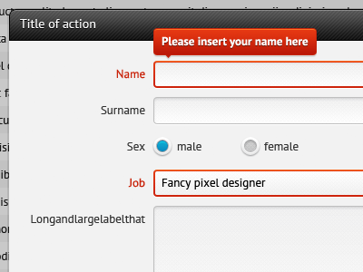
    Some more from the firestone project: the forms.

    The bubble containing more information about the error only pops up, when the field is focused.

    10 months ago

  2. Pro 483365_10150687556574769_500899768_8788991_1933571927_n Zach Inglis

    This is really awesome.

    One tip though; it's proven to be more readable if it's on the side (thus why labels are better to the left of inputs)

    Also, the title of the form is the same size as the labels. It should be more important :)

    Dig the select box too! Fantastic work.

    10 months ago

  3. Pro Twitter Bianca

    Thank you, Zach!

    Concerning the placement I agree with you! Unfortunately since the system is very flexible, there is no way of knowing how big the content in the overlay is. Therefor we decided to go with error messages displayed above the input; they are never in the way or colide with borders.

    Concerning the title: that's a valid point, I'll try that!

    Thanks again for your comment, always nice getting such detailed feedback!

    10 months ago

More by Bianca

More In Firestone

keyboard shortcuts: previous shot next shot L or F like