Pro Gov wordmark logo

Pro Gov wordmark logo
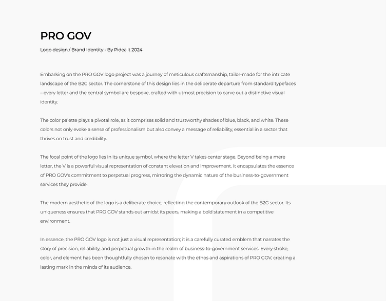
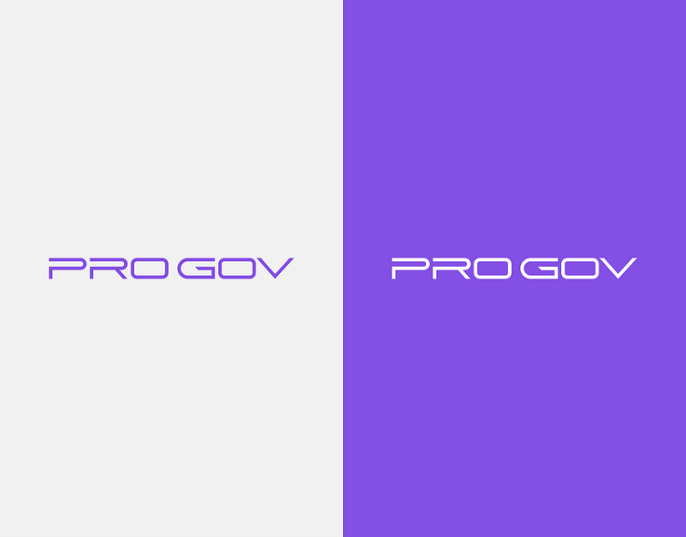
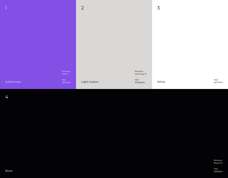
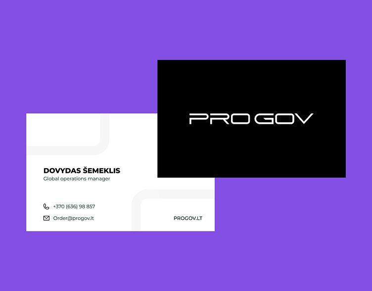
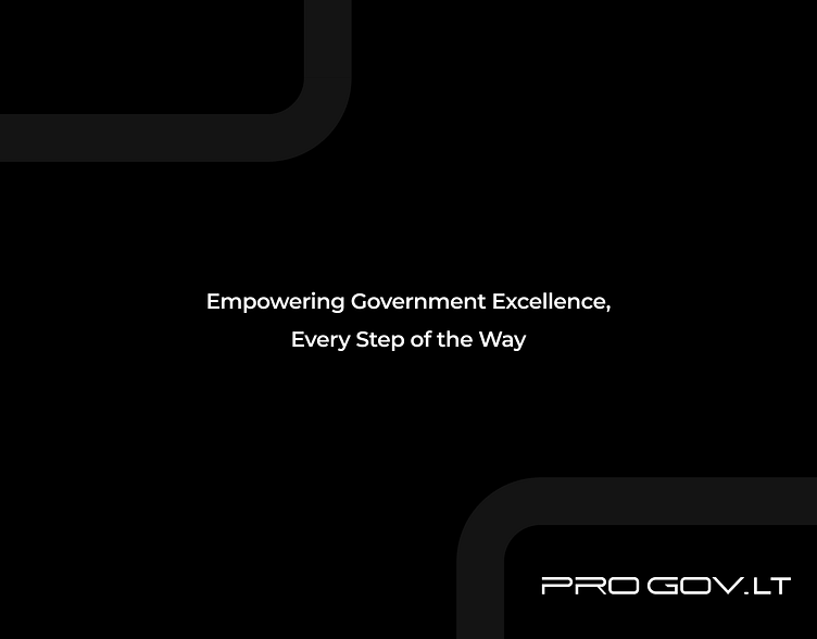
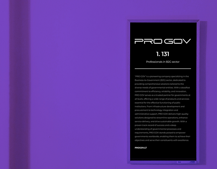
Embarking on the PRO GOV logo project was a journey of meticulous craftsmanship, tailor-made for the intricate landscape of the B2G sector. The cornerstone of this design lies in the deliberate departure from standard typefaces – every letter and the central symbol are bespoke, crafted with utmost precision to carve out a distinctive visual identity.The color palette plays a pivotal role, as it comprises solid and trustworthy shades of blue, black, and white. These colors not only evoke a sense of professionalism but also convey a message of reliability, essential in a sector that thrives on trust and credibility.The focal point of the logo lies in its unique symbol, where the letter V takes center stage. Beyond being a mere letter, the V is a powerful visual representation of constant elevation and improvement. It encapsulates the essence of PRO GOV's commitment to perpetual progress, mirroring the dynamic nature of the business-to-government services they provide.The modern aesthetic of the logo is a deliberate choice, reflecting the contemporary outlook of the B2G sector. Its uniqueness ensures that PRO GOV stands out amidst its peers, making a bold statement in a competitive environment. In essence, the PRO GOV logo is not just a visual representation; it is a carefully curated emblem that narrates the story of precision, reliability, and perpetual growth in the realm of business-to-government services. Every stroke, color, and element has been thoughtfully chosen to resonate with the ethos and aspirations of PRO GOV, creating a lasting mark in the minds of its audience.
✉️ Let's work together - labas@pidea.lt


