Letterpress Crest

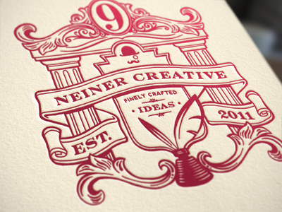
Been having some fun with my personal branding. I drew the crest originally to be the design on my data CD/DVD cases that my clients would receive with their final files.
Been having some fun with my personal branding. I drew the crest originally to be the design on my data CD/DVD cases that my clients would receive with their final files.


