


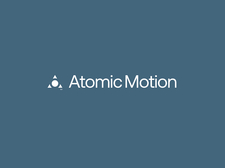
Atomic Motion: Branding


Hey folks!
Returning with something sick and fresh, this time it's rebranding for Canadian design and development agency called Atomic Motion.
The company has been creating digital solutions for major players in the U.S. and Canadian markets for more than 20 years.
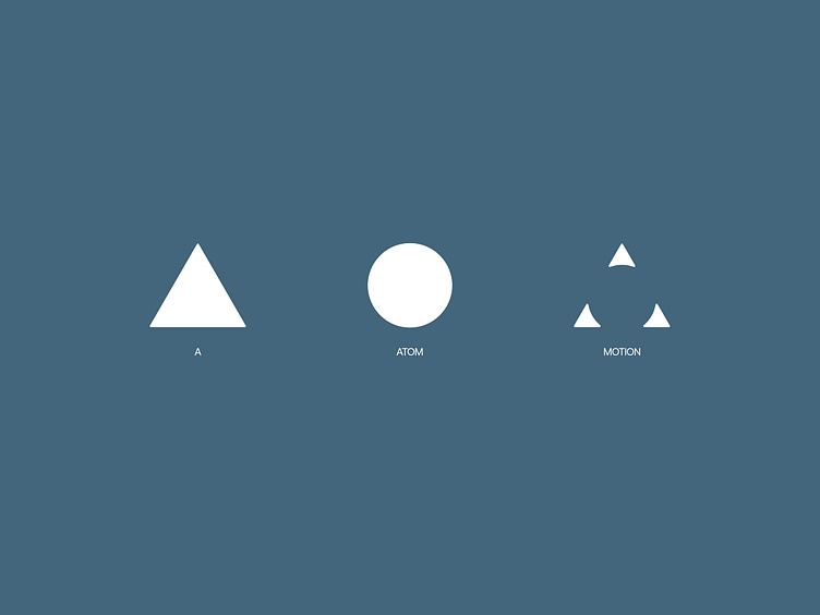
We proposed to build the company's positioning around its rich experience in the digital environment and transform the brand into a digital lab. This both reflects the company's strong expertise and works well with the name.

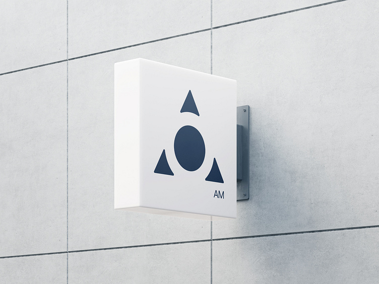
In our research for form, we were inspired by images of chemical laboratories: their sterility, rigor and precision.
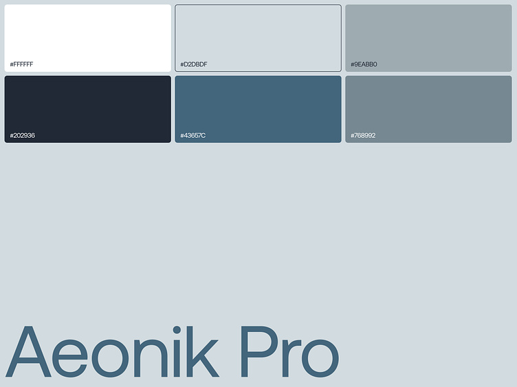
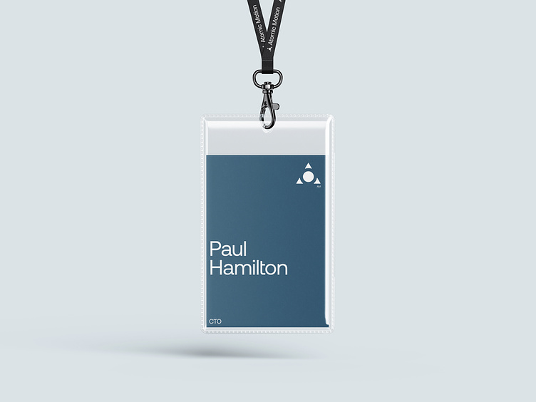
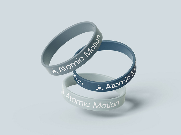
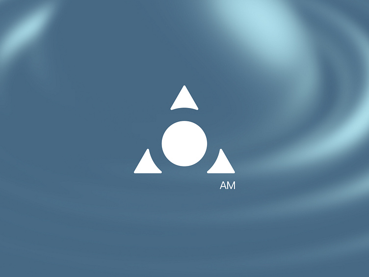
As a result, we came up with a style that could be called Neofuturism. The style is characterized by modernity, brutalism, cold calm shades, sharp edges, large technogenic typography and, of course, futurism.

We hope you like these results, let us know what you think in comments 💬
Soon we also gonna show the digital incarnation of this conception in the form of a website, so follow us to keep your finger on the pulse!
Team:
Project Manager — Olga Krupps
Designers — Maxim Berg, Margaret Plotkina
Made by Sick
Follow us:
Instagram, X, Behance, LinkedIn


