Outreach – Calendar

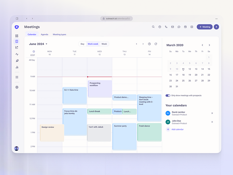
The impact of visual design on people's emotions and their perception of a product's usability cannot be overstated. With this in mind, I've crafted a fresh color palette for the Outreach calendar. The goal? To design a modern and peaceful interface for our primary users—salespeople—who navigate high-stress environments daily.
Accessibility tip: Before finalizing your design, run an accessibility check. Make sure your color palette provides sufficient contrast and is suitable for users with disabilities.
Stark– a great tool for design check
More about colorblindness – Link to article
More about color psychology – Link to article


