Distinctive web design for a damage restoration company Profix®


Hi Folks! 👋
We're excited to share our latest website design for a damage restoration company Profix®.
Scroll to see full version case study!
About the Company
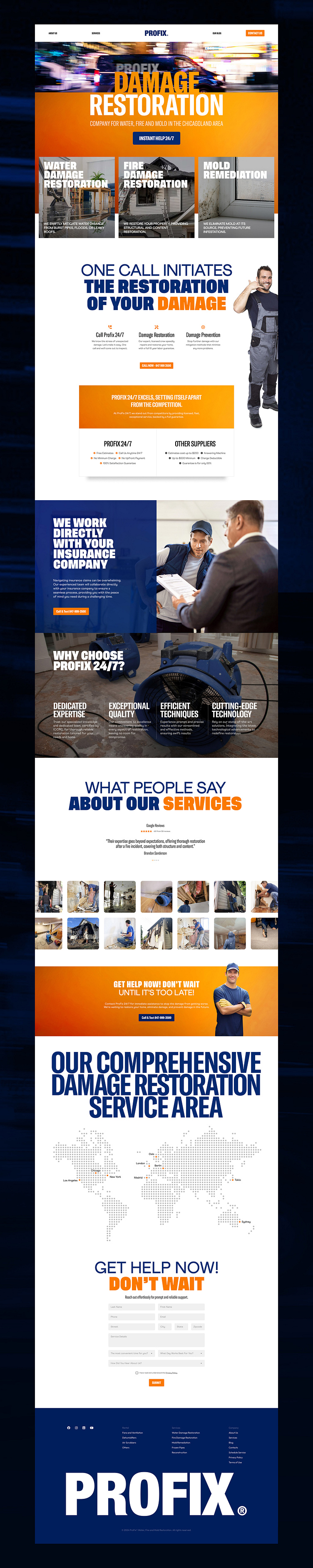
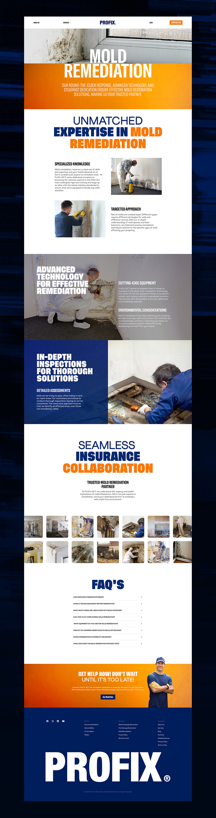
Profix® is a company based in Chicago specializing in meticulous restoration of buildings damaged by fire, floods, and mold. The company stands out for its commitment to 24/7 service, positioning itself as an industry leader known for swift and effective resolution of emergency situations.
Objective
The main objective was to develop a distinctive design that would serve as the visual embodiment of Profix's corporate identity. Considering the emotionally charged nature of their work involving dealing with stressed clients, the design needed to be bold and impactful, resonating with a sense of urgency. The primary goal was to effectively convey the company's unwavering dedication to round-the-clock service, distinguishing it among competitors.
Research
The research phase involved a thorough analysis of competitors, gathering deep user feedback, and utilizing secondary research to identify prevailing industry trends. This comprehensive approach aimed to identify market gaps and lay the groundwork for the subsequent design strategy.
UX Strategy
At the core of the UX strategy was a special emphasis on the "Instant Help 24/7" button and its strategic placement. This button was intended to serve as an immediate and necessary call to action, providing users with quick access to the assistance they sought. We achieved this by placing it at the center of the first screen and making it dark blue against a bright orange background. Integrating authentic client photos into the design was a deliberate choice, avoiding generic stock images to strengthen the company's credibility. Additionally, the urgency inherent in ProFix 24 services had to be easily translated into the language of design.
Design Process
The creative process for the homepage underwent numerous iterations, focusing on ensuring that the chosen style not only reflected urgency but also set the tone for the entire brand. The consistent implementation of real photographs, vibrant orange gradient, and selection of a characteristic font solution contributed to creating a unique and resonant visual language. This enhanced visual appeal and set the brand apart from competitors.
Testing and Launch
The culmination of adhering to a detailed plan and execution, the testing phase involved comprehensive user flow checks on various devices to ensure a flawless and smooth user experience. During quality assurance, we meticulously examined every centimeter of the developed website, double-checking each page and section to ensure it functioned as intended, rectifying errors, and making final adjustments to enhance the experience. When the chosen day and time arrived, we launched the site and conducted another thorough test to ensure everything was functioning correctly. The careful launch process ensured a smooth transition, allowing Profix to confidently showcase its refreshed brand style and website.
This extensive thematic study is evidence of the comprehensive approach of Results Factory, encompassing research, development strategy, and final implementation.
💌 Have a website idea? Let's bring it to life together!
Call us (302) 265-4218, or email us at info@resultsfactory.com


