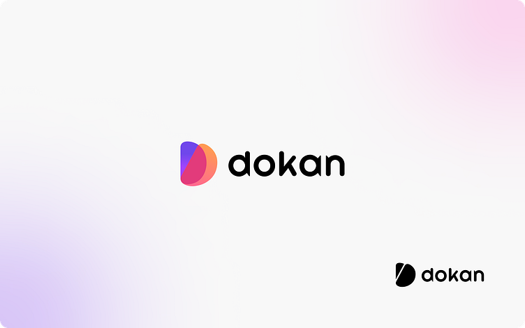
Dokan Logo


Logo Story
Dokan is a global brand that provides multi-vendor solutions. Users can easily create their own multi-vendor marketplace similar to Amazon, eBay, Aliexpress, and more, with just a few clicks. The brand’s logo reflects its name, Dokan, and the core service it provides. The logo consists of three ‘D’ letters, which represent the multi-vendor solutions offered by the brand. Additionally, with the introduction of our SaaS version, Dokan has evolved into a full-fledged ecommerce platform, catering to a wider range of online selling needs. Thus, the logo effectively communicates our main service and our expanding capabilities.