Game Application Platform Snapshot

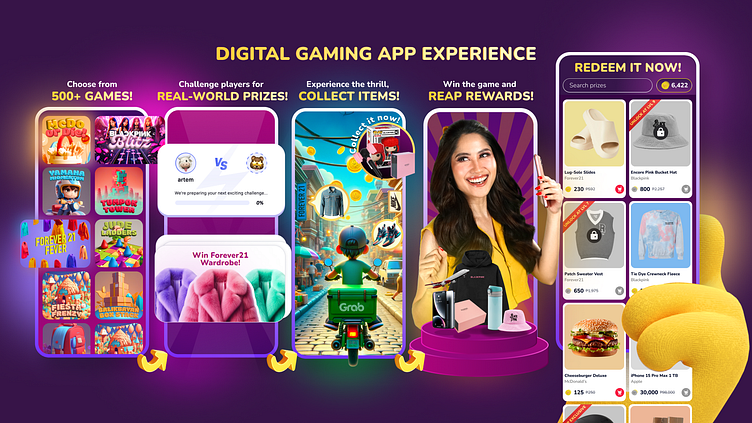
Here are some deets on the refinement of a product app poster, initially structured around a 4-step user flow, subsequently elevated to a 5-step journey. When I received the team's directive for enhanced storytelling, I already knew I had to do the following:
Extended User Flow: Incorporated a pivotal 5th step for optimal user engagement.
Illustrative Precision: Methodically refined visuals to fortify information architecture and foster a unified aesthetic.
Chromatic Elevation: Undertook a nuanced color palette enhancement to instill a captivating visual vibrancy.
Brand Cohesion: Infused strategic visual elements from our brand guidelines, featuring influencer photographs and the emblematic mascot.
Thematic Integration: Heightened the app's thematic resonance, cultivating a dynamic and immersive user experience.
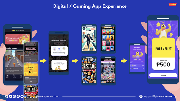

This transformative process ensures that our app snapshots transcend mere visuals, encapsulating a narrative that resonates with precision and cohesion. Swipe left to traverse the evolution.
For questions, collabs, or a chat about this design journey, connect with me at yojolo.design@gmail.com 🪁⚡️


