Report Navigator 4all


Product description
Every organisation publish their annual report and these reports are very elaborated thus very time consuming, a bit boring and in pdf formates.
To make them less time consuming, interesting and more readable we created an amazing web tool - Report Navigator 4all.
By using our product, the organisations will be able to publish their data in a modern clean way, that would be less time consuming and interesting for the investors and other interested parties.
Problem statement
There is a need of a platform for compartmentalization all the crucial data available in an annual report of any organisation.
Design Process
We started our design journey from brain storming session with product owner, where she told us all about the product and her vision. Together we explored our competitor tools and read some annual reports.
Sketching was our first step in design journey during brain storming session. In which the product owner, mentors , UX designers and the developers discussed how the product will function.
Interaction flows, I created two interaction flows. One was selected as it's visualisation page was a bit clean and easy to understand.
Interaction flow made the process faster as we designers and developers were clear about ideas and already discussed design and development milestones.

Wireframes
Landing page wireframe

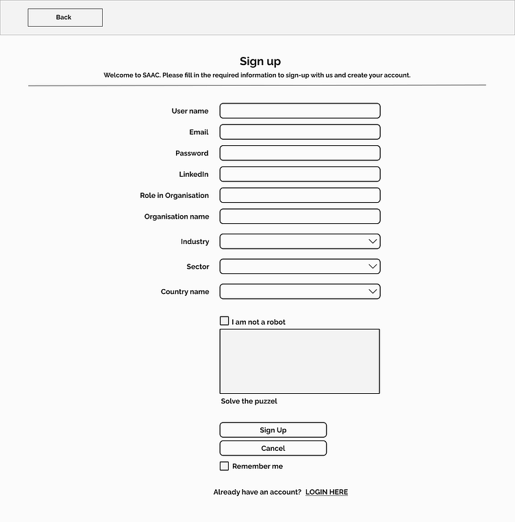
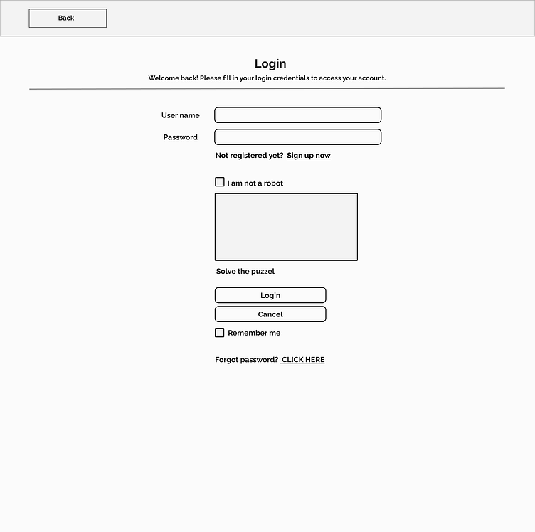
Sign Up + Login wireframes
Designing the signup page was about registering new user and keeping important relative data, whereas Login is for returning users. Both have with CAPTCHA.
Upload and visualisation page
In the upload page the user uploads data file about the organisation and in the visualisation the preview of relevant data can be seen. The annual report consists of different sections, to make it organised we decided to compartmentalise it in visualisation page. It is now more organised, neat and easy to read for users.


Webpage design
The webpage contains product description, our services and clearly displays who are our potential future users.
There is a very simple login and sign up process when a user wants to go further with our services.
If the user has any concern or query regarding our services or product, there is a contact form.
The interface
The interface consists of side menu and top navigation bar.
The side menu has all the crucial elements of a annual report and respective data will be displayed after the selected element. If the element is empty, the organisation can easily upload the respective file.
Top navigation bar is for dashboard, profile sections and a contact page making handy for user to jump in respective sections.
Sign up
The sign up form is kept with necessary details of first time user of the product. The enrolment process is in the 4 steps with progress bar shown above.
Data upload
The user goes to the respective empty element section, where there is no submitted file hence no data display is being found.
There is a overlay containing upload file and download template instructions and the submit button.
Sometimes user has file template already so in that case, there is no necessity to download the template.
immediately after file upload the data will be displayed.
Graphs
As a UX designer I communicated with the data science team and together we were able to make the graphical data more presentable in our tool.
This took few meetings and I went through 2-3 annual reports to understand about the data we are collecting and then creating the relevant graphs from them.
After that, I presented several ideas and with the product owner and the mentor's help we selected a few for our tool.


