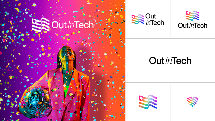
Out in Tech Visual Rebrand

Inclusion is in! A fictional visual rebrand for a very real global nonprofit, Out In Tech (OIT). OIT unites the LGBTQIA+ tech community by creating career growth and advancement opportunities for historically underestimated and underrepresented groups. With more than 30 local chapters and more than 50k global members, they leverage tech for social change, to foster community, and to ignite opportunities for all. I challenged myself to create a refreshed visual identity as vibrant and bold as the OIT community itself.
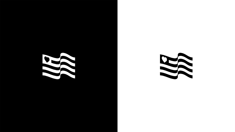
Logo Icon Inspiration
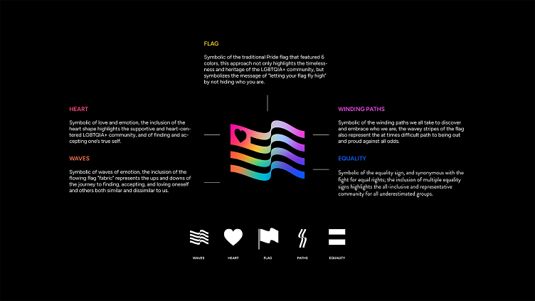
A modern take on the traditional pride flag, this approach epitomizes the message of "letting your flag fly high" by not hiding who you are. The inclusion of the heart not only represents love and acceptance in its many forms but also softens the otherwise bold and striking mark. The icon is also a nod to the American flag where OIT got its start. The overall combination of symbols and layered meaning further enriches the icon to epitomize the celebration of life, love, and inclusion found within the OIT and broader LGBTQIA+ communities.
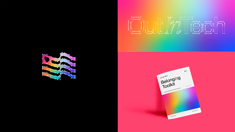
Heart Alternative Logo Icon Inspo
Used as an alternative icon for super small-scale (favicon) or for special instances (special events), this heart is pulled right from the corner of the flag. It epitomizes the message of "wearing your heart on your sleeve", and embracing who you are. The inclusion of the flowing flag "fabric" represents the ups and downs of the journey to finding, accepting, and loving oneself and others both similar and dissimilar to us. This also further incorporates the dynamic lines of the flag mark and further ties it in with the overarching brand.

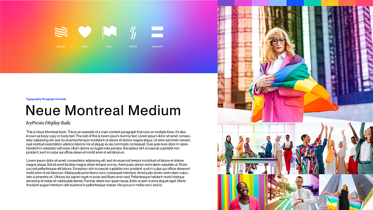
Colors Inspiration
A softened, but still vibrant ROYGBIV rainbow color scheme ties the traditional pride rainbow color palette associated with the LGBTQIA+ community, but with a modern twist. The colors, while still bold, are less aggressive and more inviting which better aligns with the welcoming and inclusive values of OIT.
Typography Inspiration
Editorial timelessness meets modern tech. The use of Neue Montreal, a sans-serif and highly versatile Grotesque font for both headers and body copy infuses a clean modern tech feel into the brand while maintaining the legibility of content and copy. The inclusion of IvyPresto, an Old Style (or Garalde) display font (influenced by formal calligraphy,) provides an elegant and sophisticated, yet still modern feel to sub-heads and headlines. The inclusion of the two balances the layered meanings and nuances of both.
Photography Inspo
The imagery serves to further strike the balance of being queer and working in corporate as well as celebrating the life, love, and culture found within the LGBTQIA+ community. It serves as a direct reminder that you can be out and professional, out and powerful, and out in tech. The depictions of queerness are purposefully as unique as the individuals themselves while still depicting each individual in a professional environment and/or professional attire.
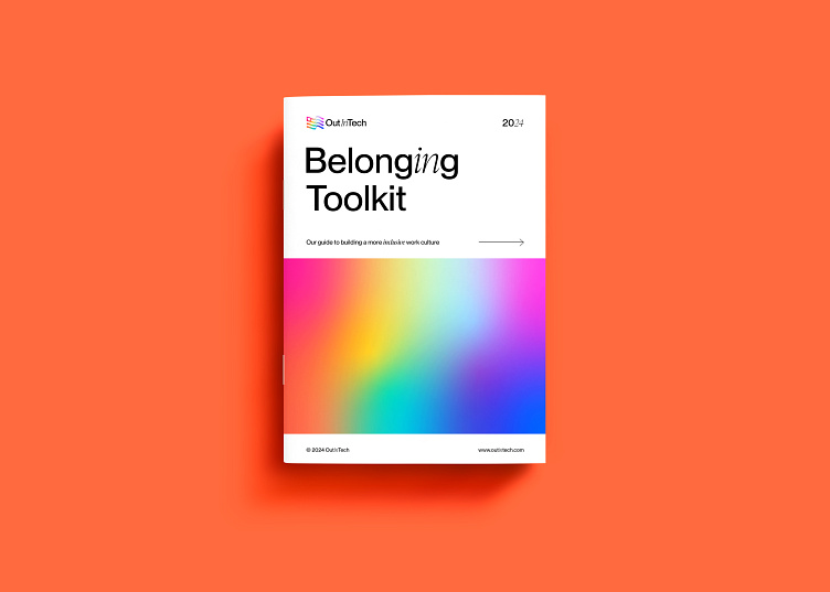
Belonging Toolkit
OIT empowers corporate tech entities to foster and grow diverse teams through their signature Belonging Toolkit -- a guide to building a more inclusive work culture. Through networking events, volunteer opportunities, training, and advocacy OIT further enables its members to flourish and thrive -- both within their careers as well as within their communities.
Wanna Learn More?
Please feel free to check out OutInTech on my website.


