Dawn branding

Brand Identity for DawnDawn is a restaurant specialized in breakfast
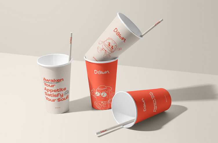
The logo adopted is a linear one, symbolizing the project’s straightforward, clear, and efficient approach to serving its customers. The color palette plays a crucial role in conveying the brand’s essence, with orange evoking the warmth, energy, and freshness of the morning sun, white representing purity and simplicity, and beige bringing a sense of calmness and reliability. These colors were meticulously chosen to resonate with the feelings of a peaceful, yet invigorating morning.
Dawn is now featured on World Brand Design
Link to page - Click here
Do you need logo & Branding for your business?
Contact me via Email: alsafakhamis@gmail.com
Instagram: https://www.instagram.com/designsbysafa1
Behance: https://www.behance.net/safakhamis


