Sambito / Branding

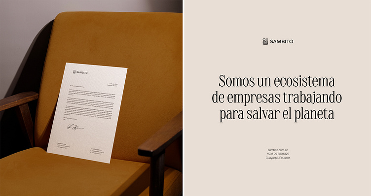
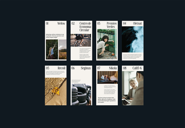
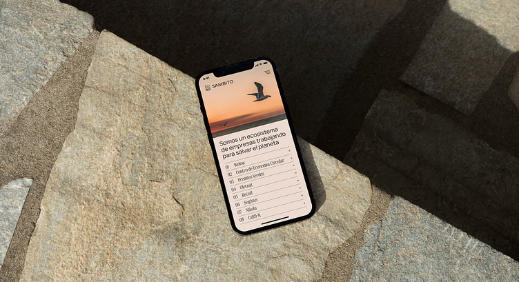
Sambito is a prominent Ecuadorian company that boasts an extensive presence across various domains through its diverse business units, each dedicated to tackling distinct aspects of today's sustainability challenge.
With over two decades of experience in the sector, we were faced with the challenging task of aligning Sambito's values and actual position in the market with its brand image through this rebranding initiative.
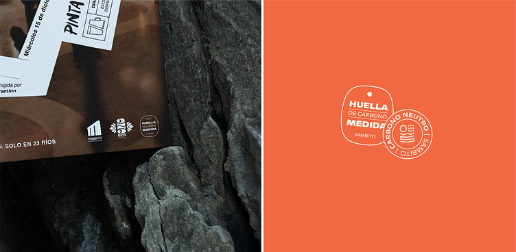
The previous Sambito brand featured the fundamental elements of soil, sunlight, water, and air that enable life on Earth. Although we retained these elements because we believe they effectively capture the broad spectrum of services offered by the brand's numerous units, we created a more simplified, iconic, and universally recognizable symbol with a modern and innovative yet approachable look.
Amidst an oversaturated green environment, we opted for a distinctive orange hue that conveys optimism and innovation.
As a result, we achieved to create an identity that, aligned with its magnitude and values, successfully serves as the parent brand of various individual environmental brands and products.