From «Prostokvashino» to «Prosto Nashe»

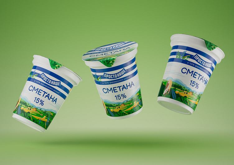
After conducting a design analysis of the previous packaging and studying its perception by consumers, we concluded that the three blue stripes on a white background are the key element of brand recognition. While the iconic character Matroskin is secondary, it is he who serves as a design element rich in detail, thus providing an important contrast to the three simple blue stripes of branding. Therefore, to remove the character, we needed to fill the design with another detailed element, which became the background narrative illustration.


