Plungie | CRO

Even in the off-season I love a good cold plunge after a workout... So when I found Plungie I immediately fell in love with their product and brand. As a value add, I decided to isolate 4 quick wins for their website. See the thread for the breakdown!
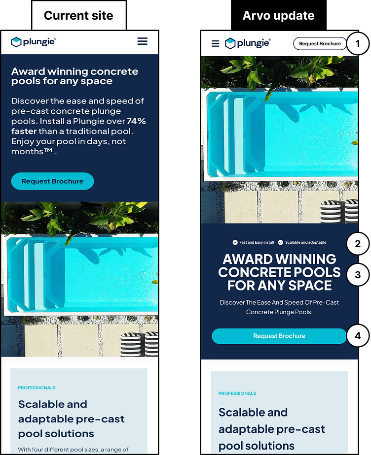
1) Take advantage of the space in the header and add an additional CTA to draw users to your most desired action. Highlight that action and make it easy for users to convert into customers.
2) Add some of your key traits to get users to purchase.
3) You’ve done a great job at separating your message from your hero image to create more impact for the users. Ensure that the most important elements of your message like your value statements stand out.
4) Make user engagement easy by ensuring key action buttons are full-width on mobile, and sit at the bottom of the fold. If action buttons are short and in the middle, or too far to the left/right, they can be difficult to reach on mobile devices.


