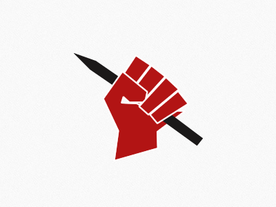
AntiSpec: The pen(cil) is mightier than the sword

Logo-big

9 Responses

  1. Mark Collins Mark Collins

    likes

    almost 2 years ago

  2. Ana GS Ana GS

    Awesome. Supporting the antispec campaign all the way.

    likes

    almost 2 years ago

  3. Pro Robert Podgórski Robert Podgórski

    Awesome - love the simple style!

    likes

    almost 2 years ago

  4. Pro Elias Stein Elias Stein

    Thank you for the AntiSpec site, as a designer, it's a great cause and an excellent resource.

    likes

    almost 2 years ago

  5. Pro Jonas Söder Jonas Söder

    Nice project!

    about 1 year ago

  6. Mark Collins Mark Collins

    @Jonas Söder The fist is a common symbol and I have no previous knowledge this German printed book, oddly.

    about 1 year ago

  7. Pro Jonas Söder Jonas Söder

    @Mark Collins youre probably right! Sorry ;)

    likes

    about 1 year ago

  8. Mark Collins Mark Collins

    @Jonas Söder No worries dude :) It's a fair call to be honest. I've done a little investigation and it looks like that book was published 2 months before I pushed AntiSpec live.

    Thanks for the edit.

    likes

    about 1 year ago

  9. Pro Jonas Söder Jonas Söder

    Its the logo from the designer, not only on this book. Seen it on several exhibitions since 2009. But youre right about the common symbol and besides it fits perfect for this project. Im an opponent against portals like 99designs too btw. :)

    likes

    about 1 year ago

keyboard shortcuts: previous shot next shot L or F like