Display Font Separator Typeface


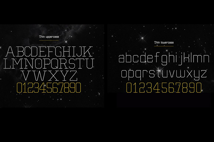
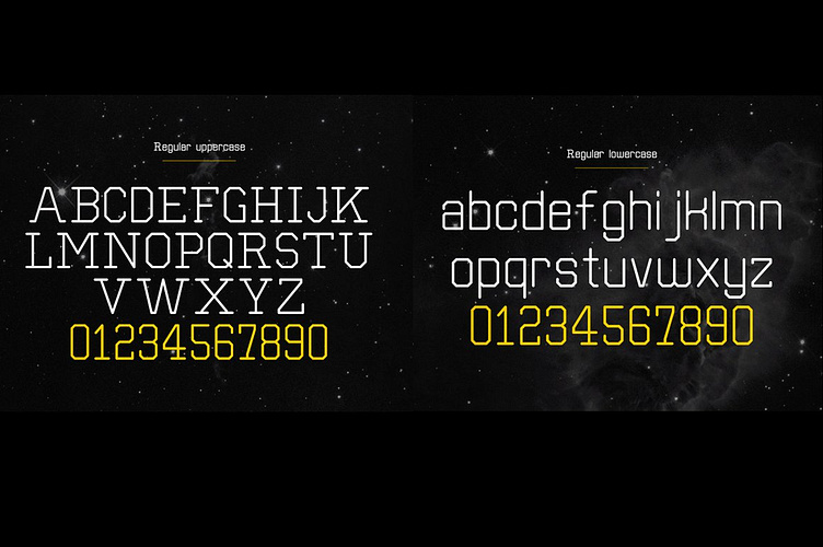

Separator was designed as an experimental typeface. It’s a simple sans serif font created without curves.
Everything with a single stroke in the same weight. A technical look and feel was what I was after, with sharp angles. Everything with equal emphasis. Its clean and geometric shapes are kind of futuristic and modern.
Best used for headlines or anything in larger point sizes. It’s available in five weights including extra light, thin, light, regular and bold.
See a quick video of it in action—
The typeface includes 298 glyphs including uppercase letters, lowercase letters, numbers, punctuation, symbols and other marks.
Check out my other fonts—
About Simon Stratford
Hello, that's me or itsmesimon, aka Simon Stratford. I design everything from custom typefaces for advertising agencies to ready to buy fonts for designers (like you) to the occasional digital oil painting for TV and print.
I've spent over 20 years in the design industry, from teaching photoshop, web design, movie promotion, and branding agencies to digital marketing—I think I've done most jobs. I got tired of the rat race and the daily commute in London. So I stopped doing things I didn't what to do—and started doing things I did want to do—more creative things.
So if you want to be part of my tribe, follow me on
Hire me
If you are interested in hiring me, I'd love to hear from you.
Thanks for looking
Simon Stratford


