Responsive Slider

Design process
For the slider required in the section of the page I was working on, I chose a relatively essential style.
That said, in designing such an essential-looking component, I still had to dwell on certain aspects.
Despite the simplicity of the design, the fact that it is a combination of different elements. You will be reminded of the concepts of Atomic Design to understand the reference. An organism composed of different molecules, themselves composed of atoms.
A large part of the design involved the thinking of which elements to be left flexible and those to be given a fixed sizing, especially in relation to screen responsiveness.
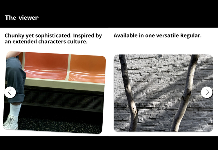
Responsiveness
Responsiveness
Below are some screenshots of how componetns behave on different screen sizes.
Desktop MacBook Pro 14

Tablet iPad Pro 12.9
Tablet iPad Pro 11

Tablet iPad Pro 11

Mobile iPhone 14 & 15 Pro Max


