Glyphic Logo & Rebrand Case Study


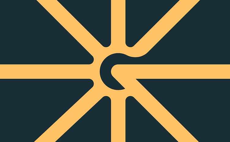
The new Glyphic mark is designed with the idea of a “hub” in mind. Similar to how rail roundhouses are the core for a rail network, we see Glyphic as the axis for enterprise understanding.
This mark also plays heavily into the hieroglyphic concept that the product name suggests. We call it The Focal Point.
See the full case study here: https://odibrand.agency/work/glyphic
--
Are you an early stage start-up, looking for a brand agency?
We would love to hear from you.
Email us: hello@odibrand.agency