The only things i would change would be to make the star that's not active a little more prominant as i looked at it first and thought where is the 5th star :)
I would also perhaps align the stars to the top of the "Time" label as the gap looks a little odd.
7 Responses
Thought I'd have a go at designing my own music player :)
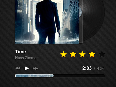
Oh and Time is clearly 5/5 just demonstrating an empty star! ;)
almost 2 years ago
Looks really nice :)
The only things i would change would be to make the star that's not active a little more prominant as i looked at it first and thought where is the 5th star :)
I would also perhaps align the stars to the top of the "Time" label as the gap looks a little odd.
but it still looks snazzy :)
almost 2 years ago
I like, but really I am not feeling the progress bar.
almost 2 years ago
Nice experiment with the progress bar.
almost 2 years ago
Very nice, but it took me a while to realize what's going on in the progress bar. Is it the album artwork?
almost 2 years ago
Thanks for the comments people. I was experimenting a little with the progress bar and positioning. Which can all be changed in the PSD :)
@Dale Yep, a mask type progress bar.
almost 2 years ago
I think experimenting with such obvious things like a progress bar is always good)
almost 2 years ago