Brand Identity for YourYogaCareer.Co


YourYogaCareer.Co is a company dedicated to helping Yoga Teachers build their businesses in easy and approachable ways. They create Kits focused on the different avenues teachers can take to create the career they want, suited uniquely to their goals and dreams. YYC.co believe that when given a hand to hold and a blueprint of how to get there, businesses in the Wellness Field can be built affordably, easily, and effectively.
The project was born in Los Angeles and its primary target audience also resides in LA. Specifically, young women under 35, passionate about a healthy lifestyle and aspiring to establish their own yoga studios.
To craft an effective verbal identity, it's crucial to identify the challenges faced by the brand's target audience. What are these challenges, we wondered? Expensive studio rent, a narrow target audience, insufficient self-confidence, and problems with motivation — these are just the tip of the iceberg.

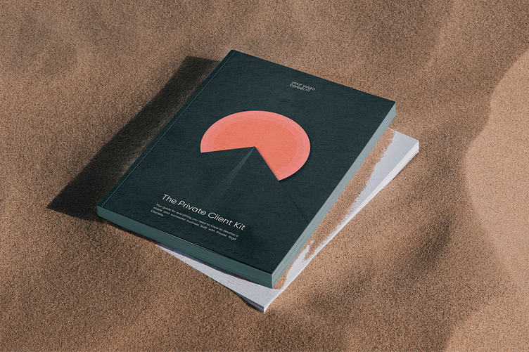
When starting on a new business, people often require a roadmap. That's why the brand's primary product is a set of Workbooks, each addressing a specific challenge that potential client may face. Questions such as "How to create your own exercise course?", "How to attract influencers to the studio?" or "How to increase the studio's recognition?" comes up in the workbooks.

To maintain a friendly tone while ensuring the brand's workbooks instill confidence and productivity, we aimed for a balanced and approachable design.


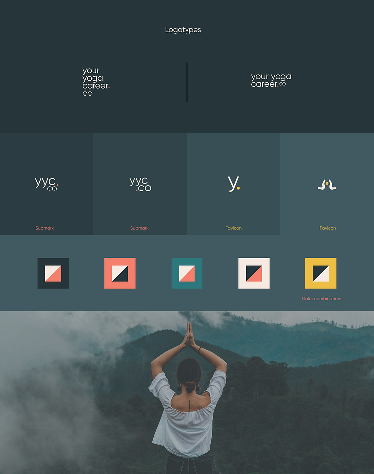
A carefully selected color palette was crucial in achieving the right balance:
Teal — for confidence, guarantees, and a serious business attitude.
Mustard — for movement, change, and direction.
Warm Salmon — for a casual, friendly vibe.


Next, we created logos. For versatility across different media, we chose Gilroy, a font known for readability in various sizes, from small gift cards to large posters.
However, common fonts need extra support. So, we created patterns to enhance Gilroy's rounded outline and give it character. No more impersonal vibes!
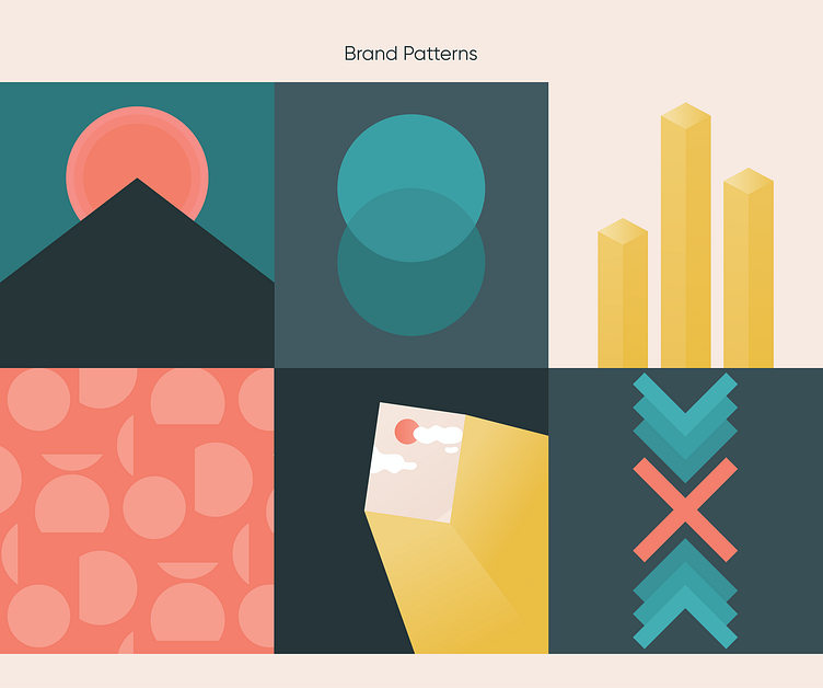


For social networks, we chose additional fonts with distinct characters. The interplay of photos with abstract forms complemented our patterns, boosting recognition on the client's socials.