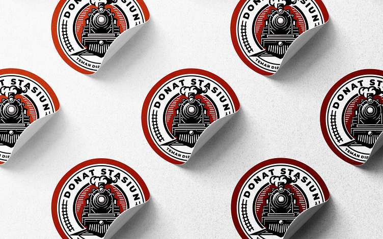
Donat Stasiun Emblem Logo Design

Hi there..
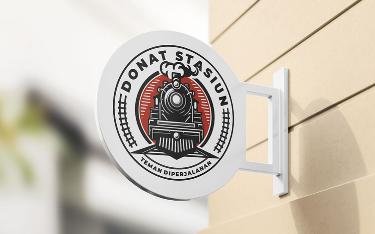
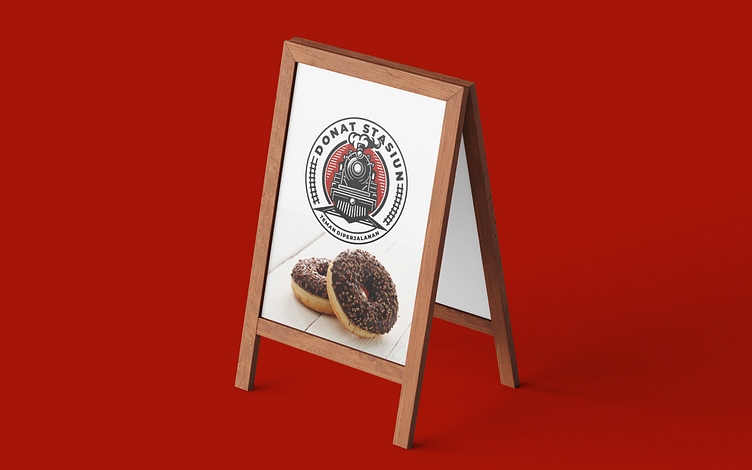
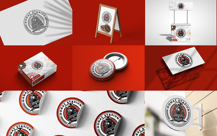
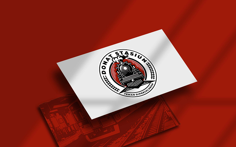
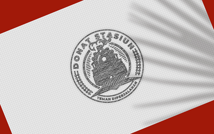
Train emblem logo design done for Donat Stasiun.
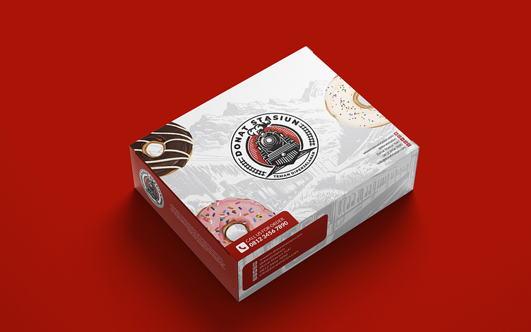
This Logo is sold to Donat Stasiun. Where the donuts are as fun as your journey! We bring you delicious donuts with a variety of cool toppings, and of course, budget-friendly. To make every trip a bit sweeter, Donat Stasiun is here to accompany you with flavors that won't break the bank. Donat Stasiun, your fun companion for every journey!
---
Do you have project? feel free to contact us. We discuss your needs.
Via Whatsapp or mail me at hafidzz@gmail.com
Follow us Instagram | Instagram | Behance | facebook
Best Regards,
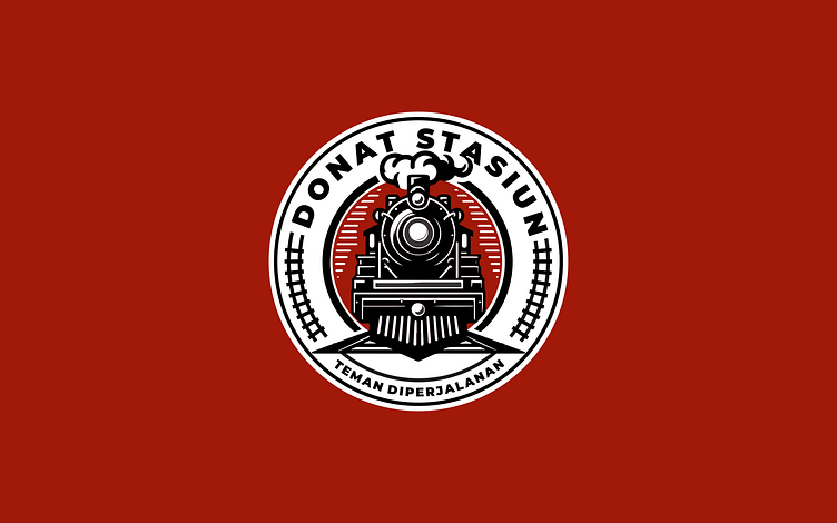
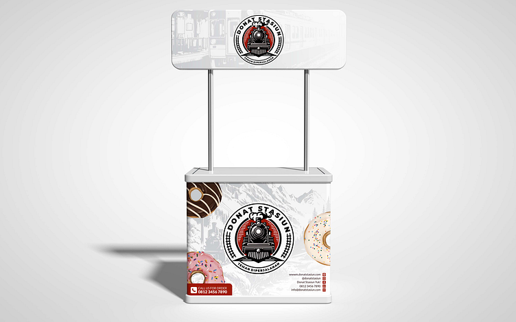
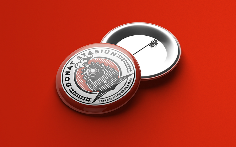
Donut Station. Where delicious treats meet classic aesthetics. The primary concept revolves around a vintage emblem style, reminiscent of classic railway aesthetics. The emblematic design adds a touch of timeless charm to the brand, inviting customers to experience a delightful journey with each bite of their favorite donuts. The color palette plays a pivotal role in capturing the essence of Donut Station. The bold combination of red, white, and black not only reflects the brand's energy but also conveys a sense of tradition and sophistication. Red symbolizes passion and the rich flavor of the donuts, while white and black add a classic and modern contrast. The locomotive serves as a powerful symbol, representing the dynamic and fast-paced nature of railway stations. This logo design is versatile and can be applied across various mediums, from storefront signage to packaging. Its impact is immediate, drawing customers in with a promise of delightful donut