Hive Logo


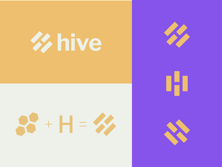
This was an unused logo for a sexual health advocacy organization that oversaw many other local organizations. The name "Hive" was to signify the multiple entities of this nonprofit coming together to work towards a singular goal. I took the name and played of this idea of a beehive, and the letter "H."
The icon combines the shape of the letter ‘H’ with a simplified honeycomb pattern represented by shapes in Libre Franklin’s characters.


