Julien, great work, love the details and yes agree with Wendell, contrast is too much. I edited the display image in photoshop (curves) to fix the contrast and I think you should have something like this. http://cl.ly/9AR7
Thanks to your feedback, I've been able to work on the brightness and contrast of the actual icons.
Also been creating a basic "Contact" one that features a rather square envelope and a pen.
7 Responses
Pro
Julien Martin
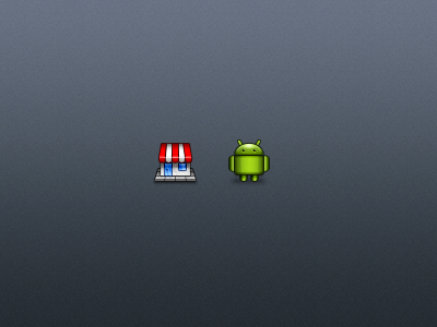
A few pixel bites of some icons I've been designing recently.
Still need a lot more practice obviously but quite happy with the actual result.
Thoughts? :)
10 months ago
Pro
♫ ♬ ♪ Wendell Fernandes ♪ ♬ ♫
I like this but it has too much contrast...
10 months ago
Pro
Julien Martin
Thanks Wendell! Does it? Damn, my mate screen might trick me. Could you tell me if it's best right there? http://cl.ly/998m
Cheers!
10 months ago
Pro
Ed Wellbrook
These are beautiful, Julien.
10 months ago
Pro
Umar Irshad
Julien, great work, love the details and yes agree with Wendell, contrast is too much. I edited the display image in photoshop (curves) to fix the contrast and I think you should have something like this. http://cl.ly/9AR7
10 months ago
Pro
Julien Martin
Thanks Ed and thanks for the tip Umar! I think I understand what you mean, icons should be brightened up a little bit more!
10 months ago
Rebound
Shop, Droid, Contact icons
by Julien Martin
Thanks to your feedback, I've been able to work on the brightness and contrast of the actual icons.
Also been creating a basic "Contact" one that features a rather square envelope and a pen.
Thoughts and feedbacks are greatly appreciated!
10 months ago