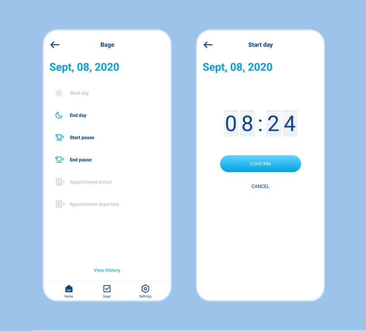
CRM app UI

Problem: users choose the wrong stage of the day and do not understand what time they choose.
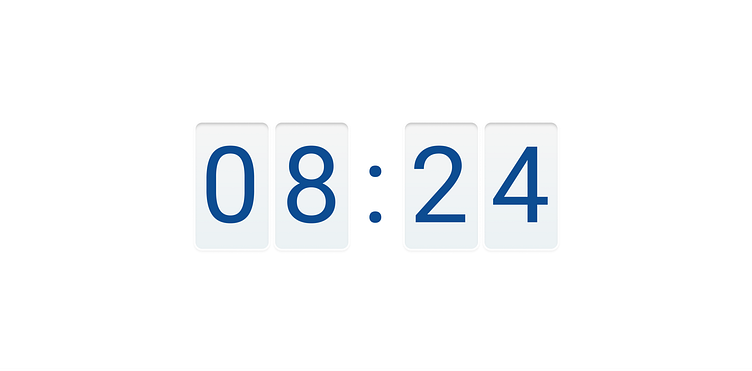
Solution: the spaces between the elements were increased for better readability, icons were added for a clearer separation of each stage, and a new understandable screen with time confirmation was made.