Grid. Design System • Yellow

∴ 30 days of #DesignSystem • Yellow ∴ Day 5 ∴
Just one more piece of general information about DS·Y global style. Today it's a
Grid system.
UI grid systems are essential for responsive design, ensuring layouts adapt seamlessly to various screen sizes and resolutions. Designers use grid systems to create fluid layouts that maintain consistency and visual hierarchy, providing an optimal user experience across multiple devices such as desktops, tablets, and mobile phones.
Advantages of Using a Grid System
Consistency: UI grids promote uniformity across different sections and pages of a design, resulting in a cohesive, polished appearance that reinforces brand identity and enhances user experience.
Visual hierarchy: Grid systems help designers establish a clear hierarchy of content by guiding the placement and sizing of design elements, making it easier for users to comprehend and navigate the information presented.
Scalability and adaptability: Grids enable designs to easily adapt to various screen sizes and devices, ensuring a consistent and responsive user experience across multiple platforms.
Improved readability: Grid systems enhance readability and make it easier for users to scan by providing structured alignment and spacing for content, making it easier to digest.
Facilitates collaboration: A shared grid framework simplifies the design process for teams, allowing multiple designers to work together cohesively and maintain consistency across different aspects of a project.
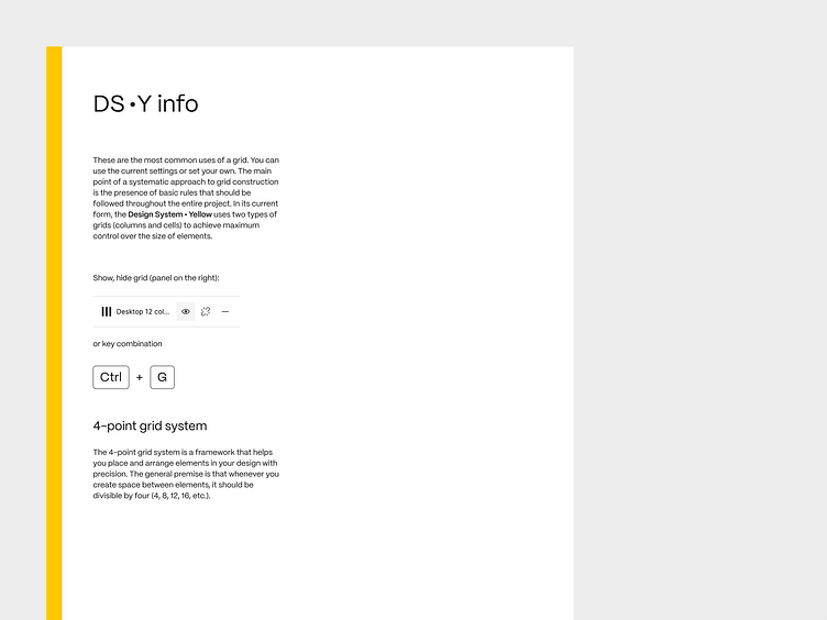
These are the most common uses of a grid. You can use the current settings or set your own. The main point of a systematic approach to grid construction is the presence of basic rules that should be followed throughout the entire project. In its current form, the Design System • Yellow uses two types of grids (columns and cells) to achieve maximum control over the size of elements.
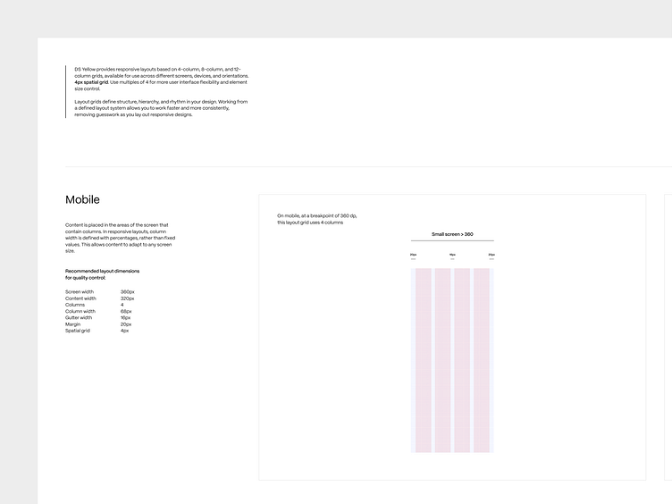
DS Yellow provides responsive layouts based on 4-column, 8-column, and 12-column grids, available for use across different screens, devices, and orientations. 4px spatial grid. Use multiples of 4 for more user interface flexibility and element size control.Layout grids define structure, hierarchy, and rhythm in your design. Working from a defined layout system allows you to work faster and more consistently, removing guesswork as you lay out responsive designs.

You can find Design System • Yellow file in Figma here 👉 https://www.figma.com/community/file/1312130033201614801/design-system-yellow
I would love to hear your feedback.
Please share your thoughts with me.


