Typography. Design System • Yellow


∴ 30 days of Design System • Yellow ∴ Day 2 ∴
Just let me share with you my vision of some of the key parts of DS·Y.
Today it's a Typography section.
Main font
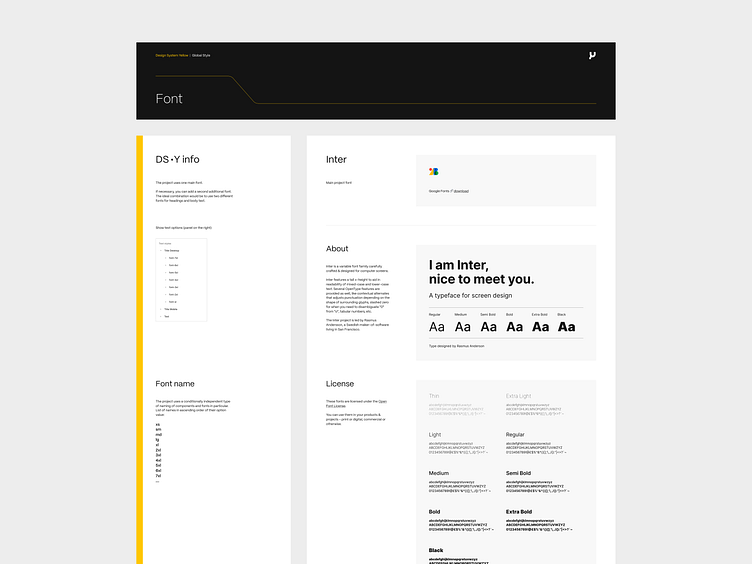
The project uses one main font. If necessary, you can add a second additional font. The ideal combination would be to use two different fonts for headings and body text. Right now it's Inter. Inter is a variable font family carefully crafted & designed for computer screens.
Font name
The project uses a conditionally independent type of naming of components and fonts in particular. List of names in ascending order of their option value:
xs
sm
md
lg
xl
2xl
3xl
4xl
5xl
6xl
7xl
....
The is no link between SEO title and the visual title size. The text style demonstrates only a visual hierarchy of content.
Line height
To place content in a 4 px grid, a font line height that is a multiple of 4 is used.

Font grid
REMs provide a more flexible and accessible browsing experience compared to pixels. It allows users to change their default browser font size, and all font sizes will scale accordingly based on the root font size. This sizing chart illustrates font size only. Has nothing to do with SEO!
Title
For greater flexibility, we use separate types of titles for the mobile and desktop. By default the mobile version titles use a grid with one step back compared to the desktop version.

Text
The font size for text doesn’t change and remains the same for mobile and desktop versions.

You can find Design System • Yellow file in Figma here 👉 https://www.figma.com/community/file/1312130033201614801/design-system-yellow
I would love to hear your feedback.
Please share your thoughts with me.


