Company Website of Velocity Studios

In a world full of AI Generated assets, where do we put the "human"?
Explore how my iteration went to humanize the first version of our company's website. This is not just a story; it's an immersive exploration of who we are, what we stand for, and the path we've paved in the dynamic world of design and technology.
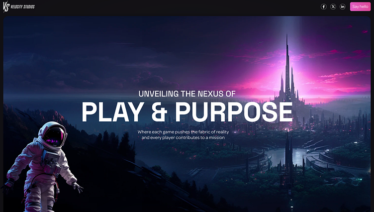
The future is hopeful
In the 'before' frame, explore the conventional portrayal of the future. A landscape entrenched in masculine narratives, marked by apocalyptic undertones, and a visual cacophony that hints at disorder and uncertainty.
With a stroke of innovation, the 'after' frame unfolds, revealing a feminine touch to the future. Behold the emergence of natural landscapes, tranquil lakes mirroring serenity, and the introduction of a character seamlessly woven into the evolving narrative.
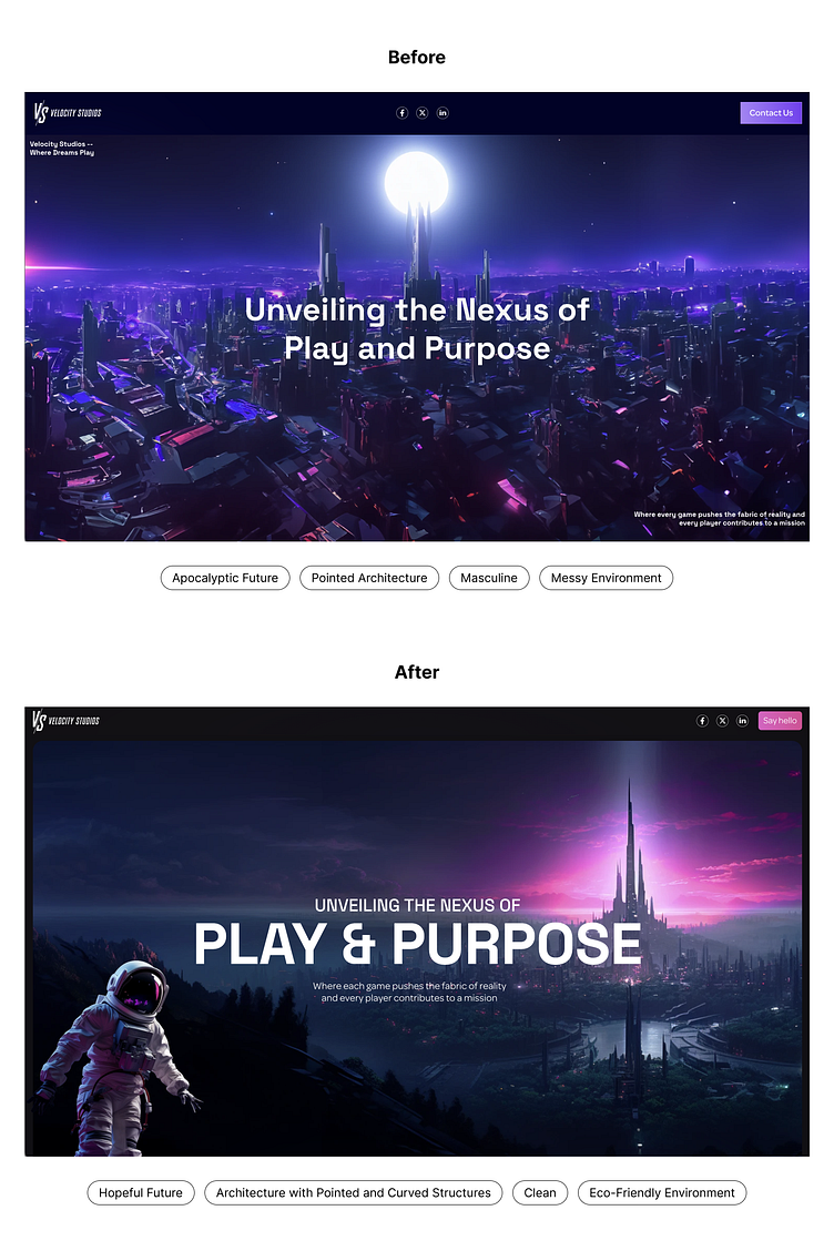
More is not always more
In redefining the maxim "the more, the merrier," our focus in this section was to symbolize the evolution of games over the years. The 'before' presentation resembled a disordered mosaic of random artworks from diverse artists, lacking a coherent narrative. Despite the abundance, it failed to convey the evolving story of gaming.
Enter the 'after' image – a refined composition representing the past, present, and future of gaming with concise precision. Here, less truly is more. Each carefully chosen element contributes to a succinct portrayal, avoiding information overload. This approach allows the audience to absorb the essence of gaming evolution, savoring simplicity in a narrative that speaks volumes without overwhelming.
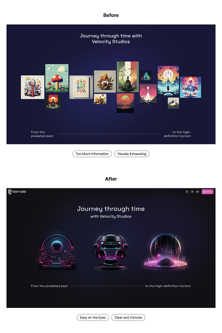
Design should be inclusive
Before, the illustration featured just one boy, a representation that didn't align with our vision for inclusive communities. Our aim is to break free from stereotypes and cultivate a space where diversity thrives. Games are not exclusive to any gender or demographic; they are a universal experience meant for all kinds of people and even different species.
This shift in representation underscores our commitment to fostering an inclusive gaming environment that transcends traditional boundaries.
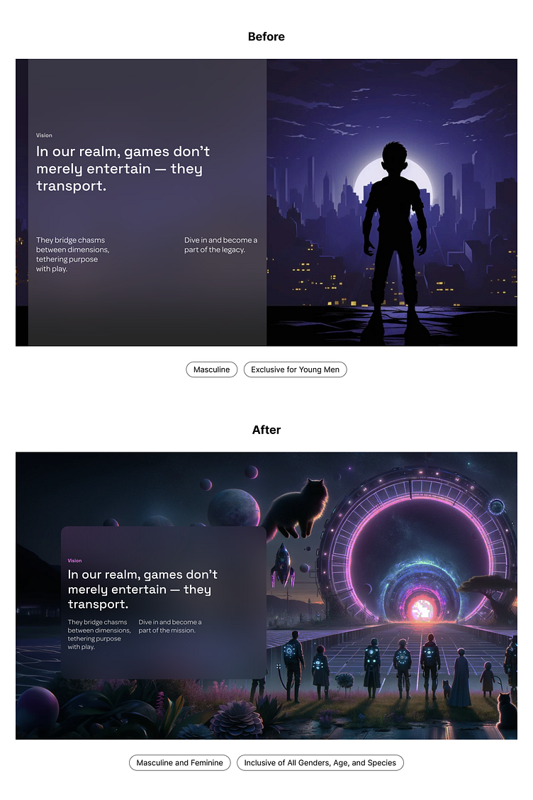
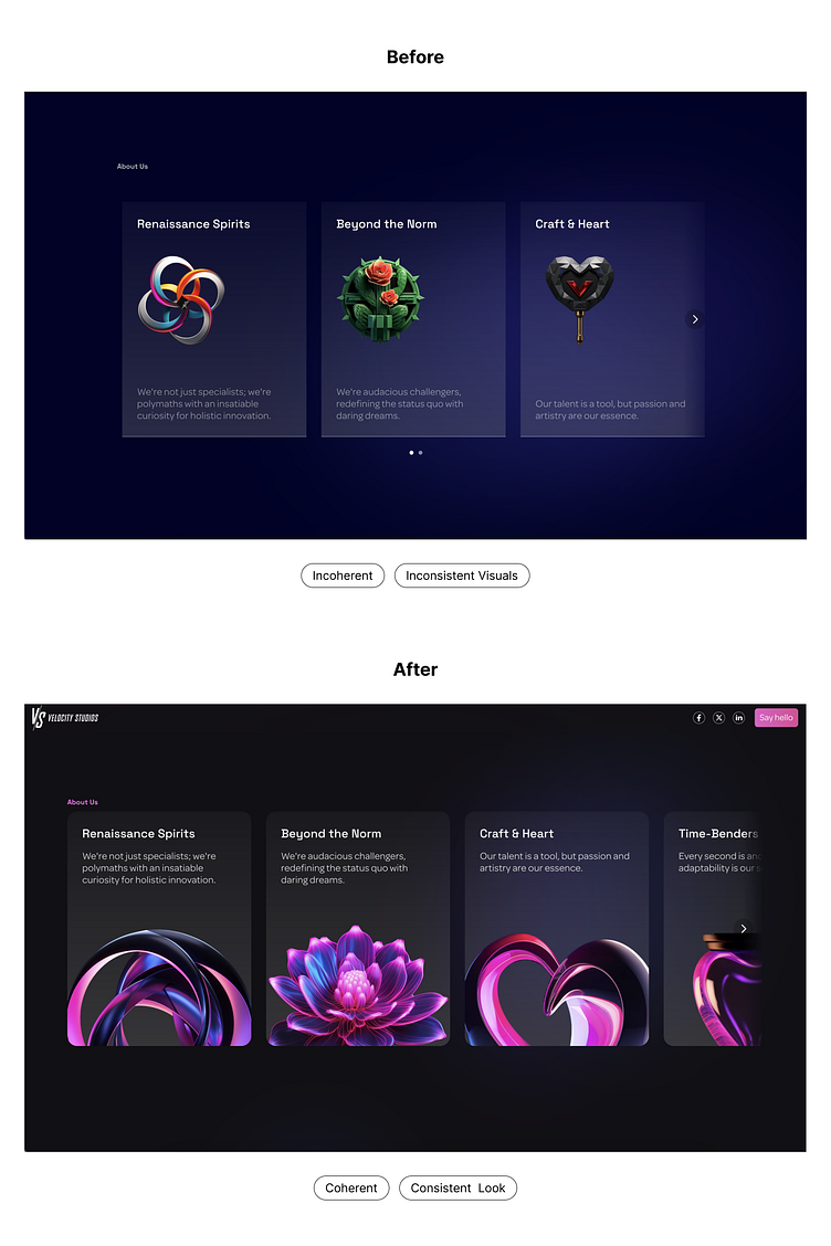
Ensuring Consistency:
The 'before' illustration presented a collection of cards with vastly different styles, failing to convey a coherent message. The carousel lacked uniformity, making it challenging to discern the intended theme. I
In contrast, the 'after' image showcases a remarkable transformation – a display of consistency and cleanliness. This revamped look harmonizes seamlessly with the established visual guidelines of the company, reinforcing our commitment to a unified and polished visual identity.
The fusion of design and technology awaits your exploration!
For insights, collaboration inquiries, or just a casual chat about this exciting intersection, feel free to connect. Shoot me a message at yojolo.design@gmail.com ⚡️🪁


