Retcon icon

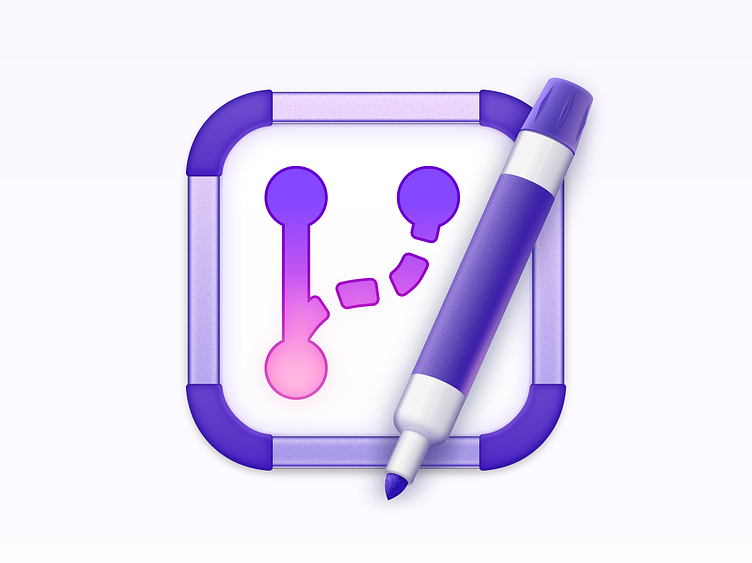
This is the icon for Retcon, the macOS app for rewriting git history at the speed of thought. My first Mac icon! Rendered in Sketch, with reference renders in Blender.
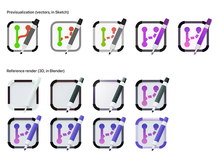
I followed a process described in an article from Marc Edward: start with concept sketches, create a 3D version of your icon as a reference, then render the final icon in vectors.
The 3D reference allows the icon to have realistic shapes and lighting—as seen on the pen—but the vector re-render means the icon's look can be fully controlled; great for aesthetics, and legibility.
Concept
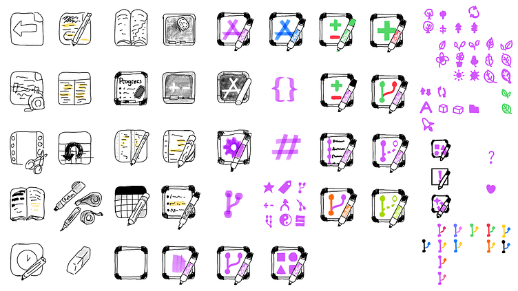
Retcon allows you to modify git history very fast, with the same ease you'd move a folder in the Finder, or rename a file. That's what motivated many of the concepts: splicing a movie, tearing pages from a book, redacting a page, etc. The app's all about fast editing.
Ultimately, the whiteboard felt like the clearest metaphor. A close second was the blackboard, but while that might have made for a more visually pleasant icon, it also felt less modern, which wasn't the appropriate for the app.
Some of my favorite concepts are the whiteboard titled “Progress”, and the blackboard being erased; but, while they're pretty compelling as rough sketches, these concepts would probably have been much too busy as actual icons.
Symbol
The whiteboard features a git “branch” icon, which feels like a rather obvious choice in retrospect. It immediately ties the icon to git, and slightly hints at history and branch manipulation.
I explored many symbols, though, before settling on this one. Most notably, I looked for a less direct depiction of a git history; something more concrete and relatable, like the tree-related symbols. I eventually decided that the absolute clarity of the actual symbol for a git branch worked perfectly, in the context of the icon. In Retcon, you're literally erasing and rewriting branches!
Another very tempting choice was Apple's “A” app symbol. It evokes development very clearly, and has strong (and hopefully positive) associations.
However, it evokes app development, rather than software development in general, which is too specific for Retcon; and it feels owned by Apple, at least in culture, if not as a trademark.
A vector previz, and a 3D render
These really helped nail down the icon's layout, scale, and overall look. When then rendering the final icon, I heavily referenced the pen, for realism, but mostly made up the board, which wasn't modeled very interestingly in the 3D model.
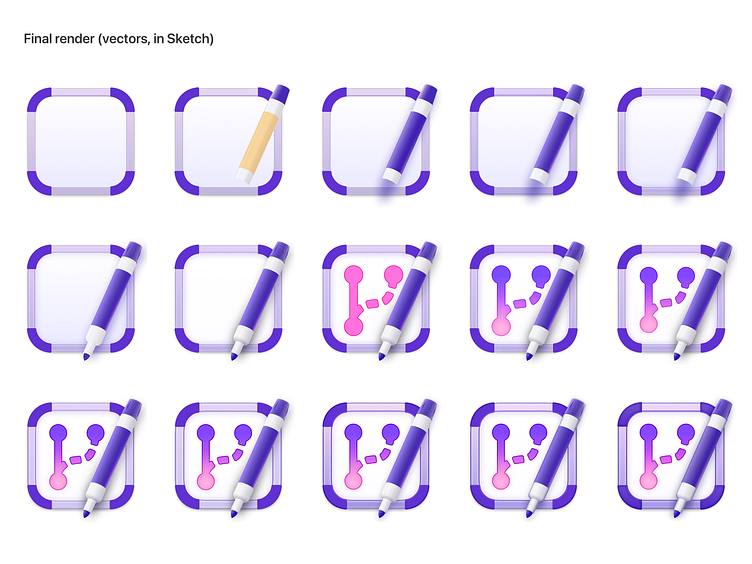
Final render
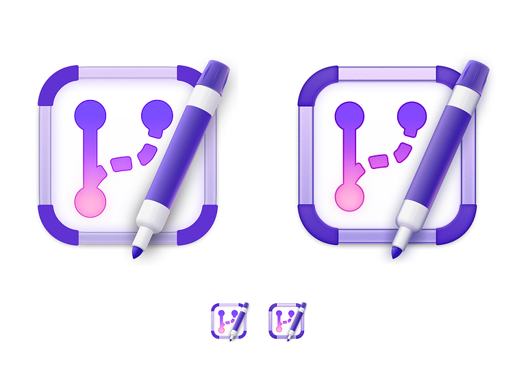
Balancing viewing scales
Although Mac icon files can contain many variations, that the system then selects from depending on icon display size, I decided to only create a single size. (or perhaps forgot that you could create these variations. events unclear!)
That meant the icon had to work both when displayed large (as a marketing asset, or when inspecting by the user using Quick Look) and small (in the Dock, in the Finder).
Of the two, the smaller size was definitely the more important one, being the icon's usual display scale. That meant sacrificing good-looking small details, if they muddied the icon when viewed small.
You can see this tension in action in the two-up comparison below. A WIP shot is on the left, and the final icon is on the right.
The final icon is coarser, its various borders thicker, its shadows heavier. The end result is a lot less elegant when viewed up close, but vastly more legible when viewed at Dock size. The process of removing subtlety was painful, but ultimately made for a much better icon!
Objectives
Going in, I had objectives in mind; some essential, some optional. The icon definitely doesn't fulfill them all, but compromises are core to design, no?
The essential goals are predictable:
Be a functional icon: Be recognizable, legible at small sizes, and evocative of the app itself. ◆ That one's a go! As the most important goal, it forced quite a few decisions, as described above.
Look at home on macOS: The system has its own design language. It's a rather strongly-defined one, although there's still a lot of leeway for experimentation. ◆ I think the icon does just fine here. It's realistic but not actual 3D, and respects the round rect while playing with it a little. The pen really helps, too—more on that below.
The optional goals were a bit more personal:
Use varied materials: While assembling a board of reference material, I kept encountering app icons that felt nice, but… were somehow just short of great. Eventually, I realized that they often fell into the trap of having every component rendered the same way: the whole icon would look like a plastic model of a thing, instead of looking like the thing itself. To counter that effect, I really wanted the icon to feature different materials, of which the different properties would contrast in the final render. ◆ I don't think I did an excellent job, here. There's certainly diversity: slightly rough metal for the board frame, shiny white plastic for the pen's body, and some variations of plastic and paper. However, especially when viewing the icon at a small scale, the material differences barely stand out; only the metal frame's telltale shine makes it stand out from what otherwise looks all-rubber, or all-plastic.
Include a tool: Some of my favorite Mac apps have a tool on their icon. It's an old convention, that screams “this app will let you make things”. I love creation apps, and I love this association—so it was important to me for Retcon's icon to feature a tool. ◆ I'm happy I got to do this one! Luckily, the best concepts for the icon all made including a tool natural, if not necessary. The most observant will notice that the pen is shifted right from the standard, Big Sur-style tool location, but the appropriate 24° angle is respected!
Show ample color: It's so nice to look at something colorful. I wanted the icon to have a well-defined dominant color, and feature it prominently, with a large portion of the icon being painted. ◆ Well, that one's a wash—the icon does have a clearly-communicated tint, but it's not used over large areas; instead, the most represented color by far is classic whiteboard white. Gotta pick your battles!


