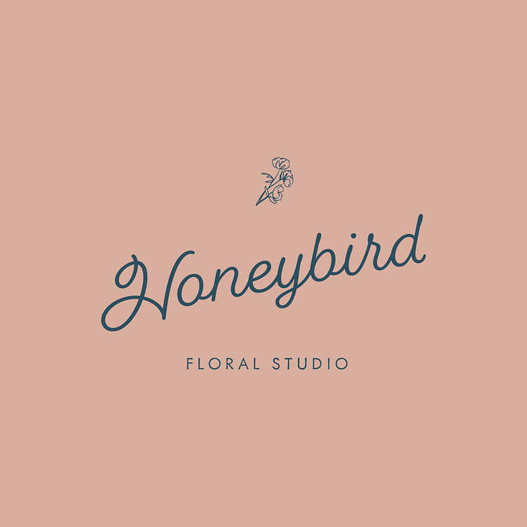
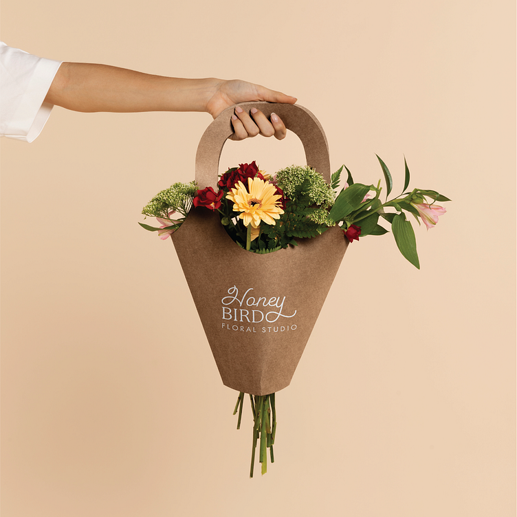
Honeybird Floral Studio Brand Identity


In this branding case study, creating a brand that spoke to and uplifted the company’s core values of sustainability, transparency and accessibility was our Key Branding Goal.

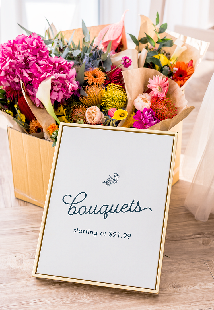
Enter your text here...Our job was to create a logo suite for Honeybird Floral Studio that is timeless, sophisticated, modern, and simple. Based off of the brand strategy, it was clear that we needed the branding for Honeybird to feel inviting and warm, yet professional, modern, and eye-catching as well.To achieve this, we utilized a modern and playful script display font as the heading type choice for the branding. We paired this type choice with a chic sans-serif that really compliments the script well. The script gives the logo a personal and handwritten feel. This can be used to emphasize the personal touch and care that goes into creating each floral arrangement, making customers feel like their orders are crafted with individual attention and care. From there, it was all about adding simple, yet luxe illustrations to the branding to elevate the type while still maintaining a simple yet intricate feel to the branding. Color also plays a strong role in portraying elements of sophistication yet modern simplicity, while balancing these choices with warmer tones that help the brand feel approachable and friendly as well.